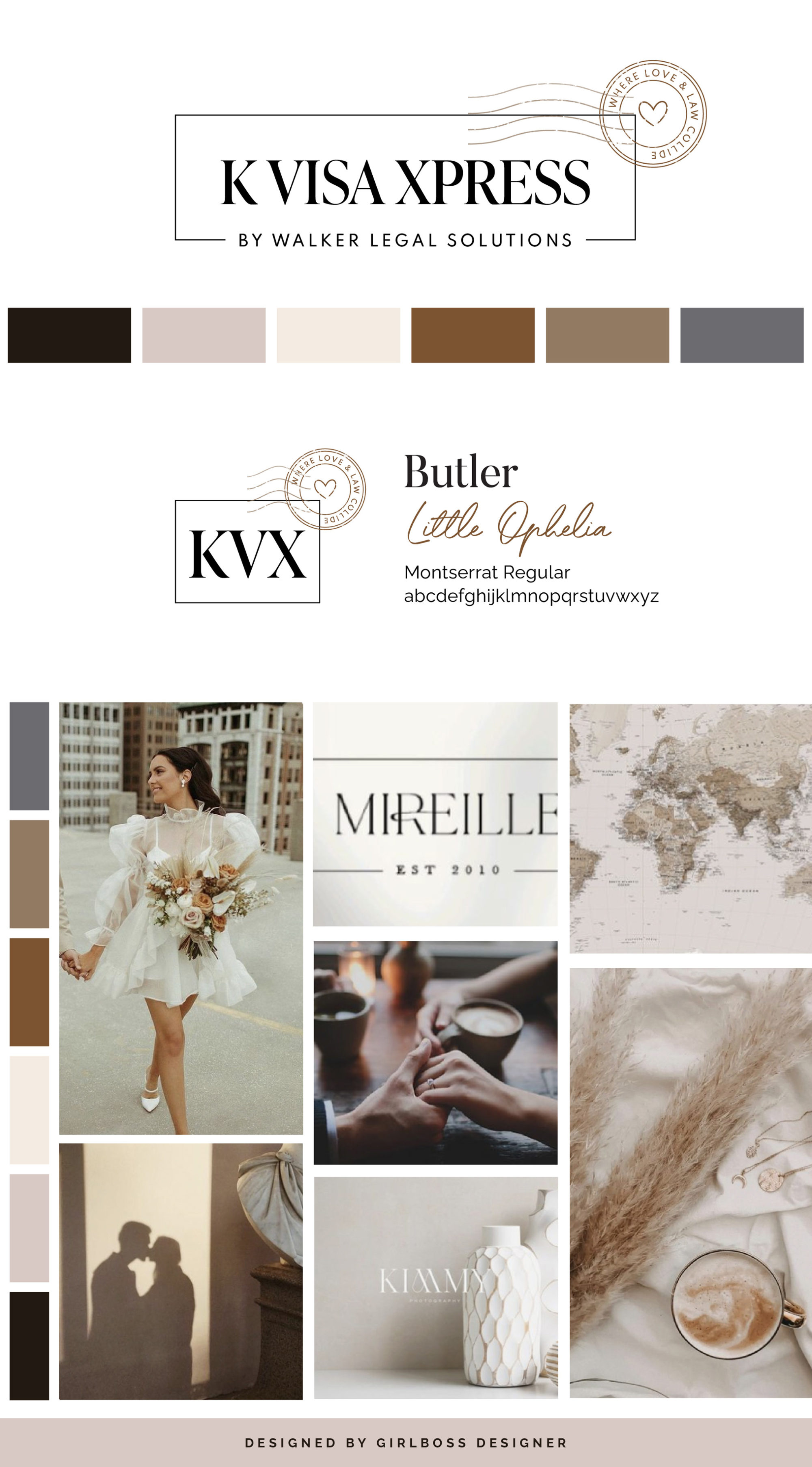
Chelsea from K Visa Xpress wanted her rebrand to have a sophisticated, elegant, confident, dependable, and classic feel. She was inspired by warm neutrals, love, and typographic logos.
For her brand colors, we went with warm neutrals from a soft tan to a chocolatey brown that represents warmth, support, and dependability. With it, we brought in blush and cream to add a feminine touch and bring in that light, airy, and romantic feel.
The logo features a circle with a tagline “where love & law collide” that is meant to resemble a travel stamp that you would get in your passport since her business consists of helping bring 2 people together, one from a different country. The serif font used has varying weights within the letters and that is going to give it a more classic and sophisticated feeling.
Don’t forget to check out the website reveal here.
You can check out branding and website by clicking here.


KVisaXpress is a law firm helping international couples reunite in the United States.
Their goal is to unite you and your loved one using all avenues of the law available. They take great pride in providing effective immigration legal services and exceptional customer service every single day. They’re absolutely here for you.
The staff at KVisaXpress work as a team to exceed each of their clients’ expectations. Whether you need a consultation or want to hire a lawyer, they can help. They have years of high-level experience helping clients navigate USCIS without requests for evidence.
Are you ready to launch that new business or elevate your current brand/website? Check out our services!
Girlboss Designer specializes in the travel industry and the online coaching industry – all serving women entrepreneurs. CLICK HERE to learn more about our services and how we can help!
