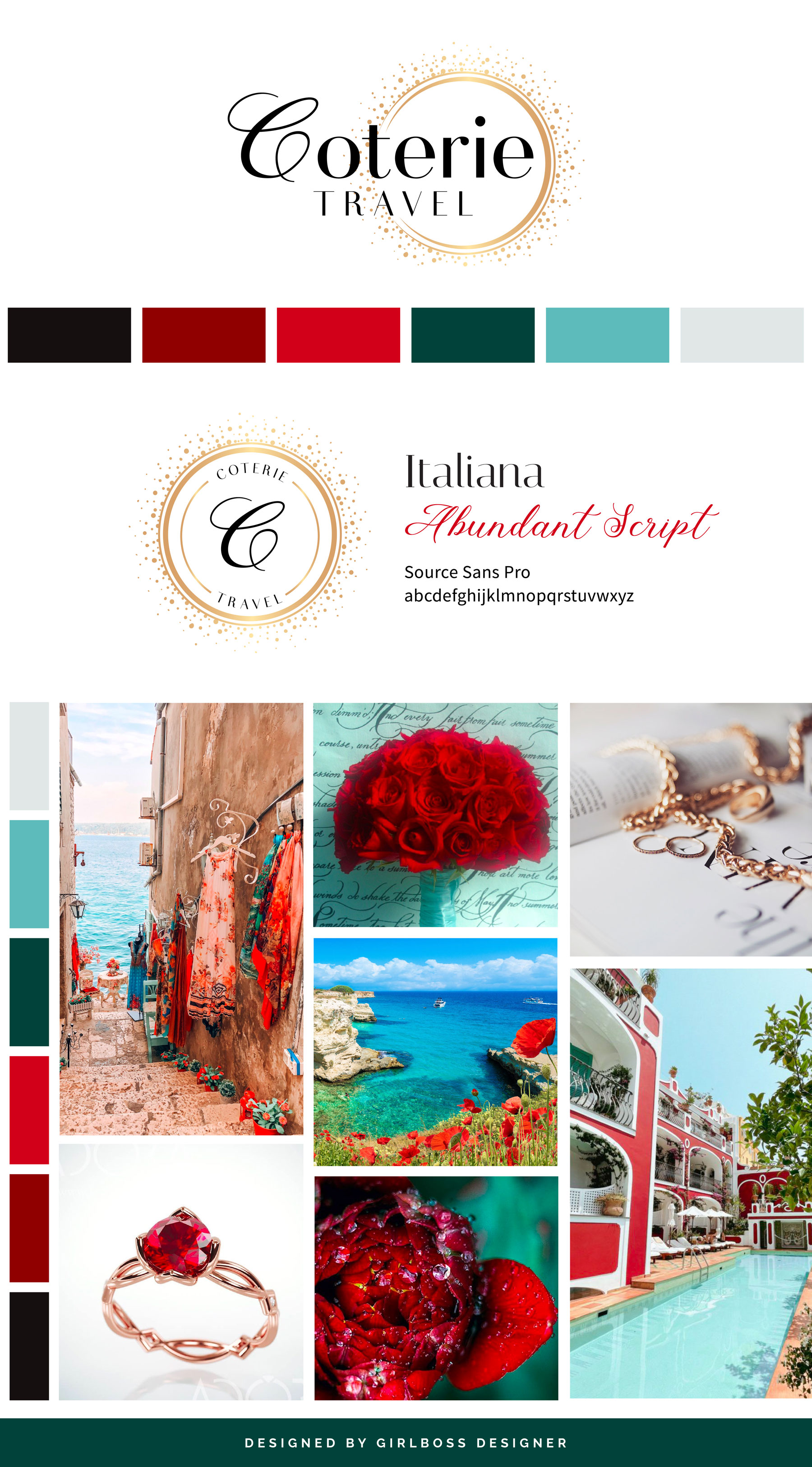
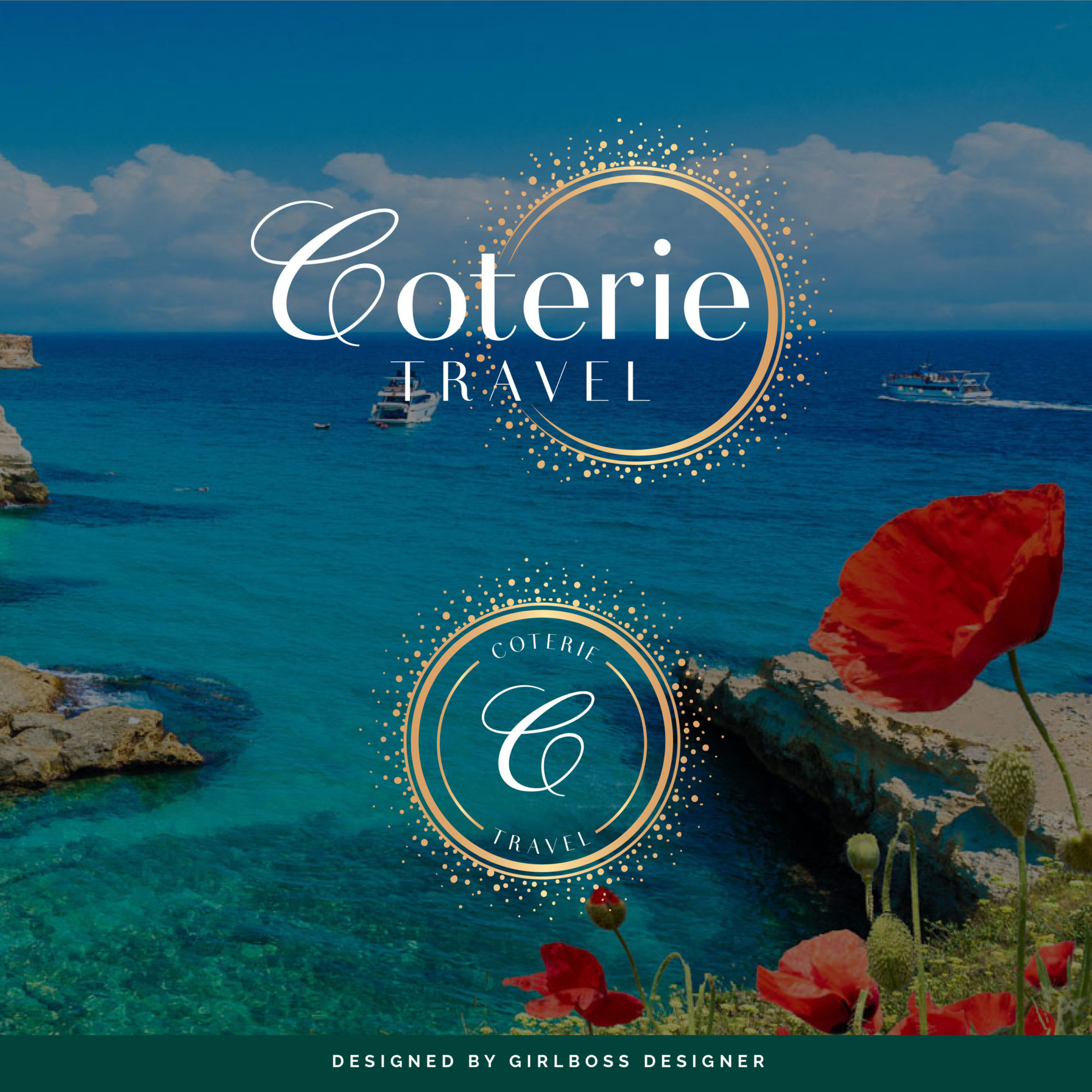
Shelley from Coterie Travel wanted her brand to be professional, confident, and luxurious while still being bold and incorporating bright colors. She was inspired by jewel tones and gold circles that represent a coterie.
For her brand colors, we went with bold jewel tone colors like ruby red, emerald green, and a bright turquoise to give it that extra pop. These colors give her brand a very bold, confident, and luxurious feel.
For her brand fonts, we went with a san serif font with varying thicknesses to give it a more sophisticated modern feel while also incorporating a script “C” to bring in that extra bit of luxury.
Her gold circle symbol is meant to represent a coterie, i.e, an exclusive group, a circle of friends.
Don’t forget to check out the website reveal here.
You can check out the branding and website by clicking here.


Shelley loves to travel. She is awestruck by the beauty of God’s earth and she rarely returns to the same place in her travels because of her insatiable desire to see and do it all.
She is also a hotel snob. Gone are the days when just any hotel would do.
In essence, she discovered the joys of exceptional travel. Of luxuriating in the world’s best hotels and of friending local guides who will introduce her to little-known secrets of their fragment of the globe.
Are you ready to launch that new business or elevate your current brand/website? Check out our services!
Girlboss Designer specializes in the travel industry and the online coaching industry – all serving women entrepreneurs. CLICK HERE to learn more about our services and how we can help!
