


Elizabeth, the founder of Outlander Travel, wanted a rebrand that felt elevated yet familiar—something that maintained the charm of her original branding while introducing a more professional, timeless, and effortlessly modern feel.
To bring that vision to life, we curated a color palette of shades of blue, a vibrant orange, and warm neutrals. The blue tones convey professionalism and calm, while the orange adds a welcoming, confident energy. The warm neutrals ground the palette, creating a sense of balance and timeless sophistication.
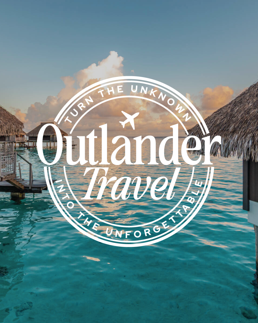
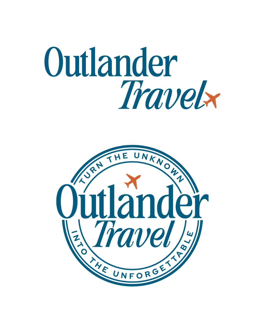
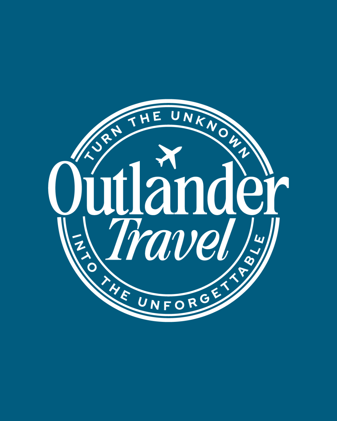
The new logo blends classic typography with a modern twist, drawing inspiration from the original design. We chose a retro-style serif font to evoke a sense of character and familiarity, paired with a subtle plane icon—an homage to the brand’s roots.
Don’t forget to check out the website reveal here.
You can check out the branding and website by clicking here.
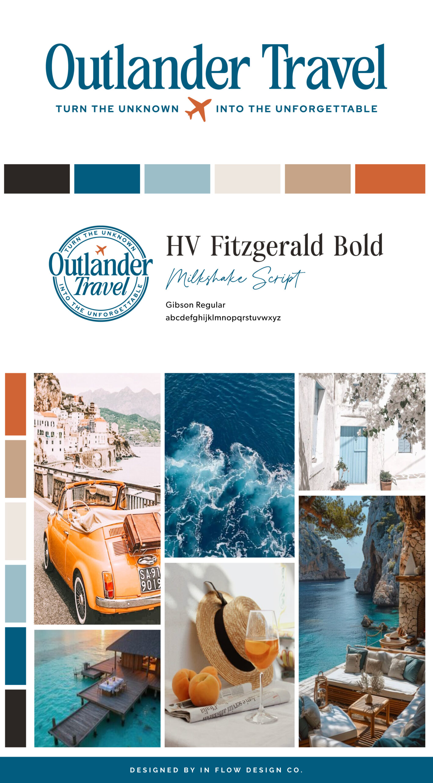
Elizabeth’s love for travel began early, inspired by her father—a seasoned traveler—who dreamed of sharing all he had learned from his years on the road to help others enjoy more comfortable, well-planned journeys. Some 32 years later, after a full career in library science and well after her father’s passing, Elizabeth brought that dream to life by founding Outlander Travel. Since then, she has used her personal experience, education, and professional training to craft meaningful and memorable travel experiences for her clients. She holds a BA in Secondary English Education, an MLIS degree, and industry credentials including CLIA-Accredited Cruise Counselor certification and graduation from the College of Disney Knowledge.
Are you ready to launch that new business or elevate your current brand/website? Check out our services!
In Flow Design Co. specializes in the travel industry and the online coaching industry – all serving women entrepreneurs. CLICK HERE to learn more about our services and how we can help!


