Carrie, the founder of Forshner Luxe Travel, envisioned a brand that exudes timelessness, sophistication, and luxury.
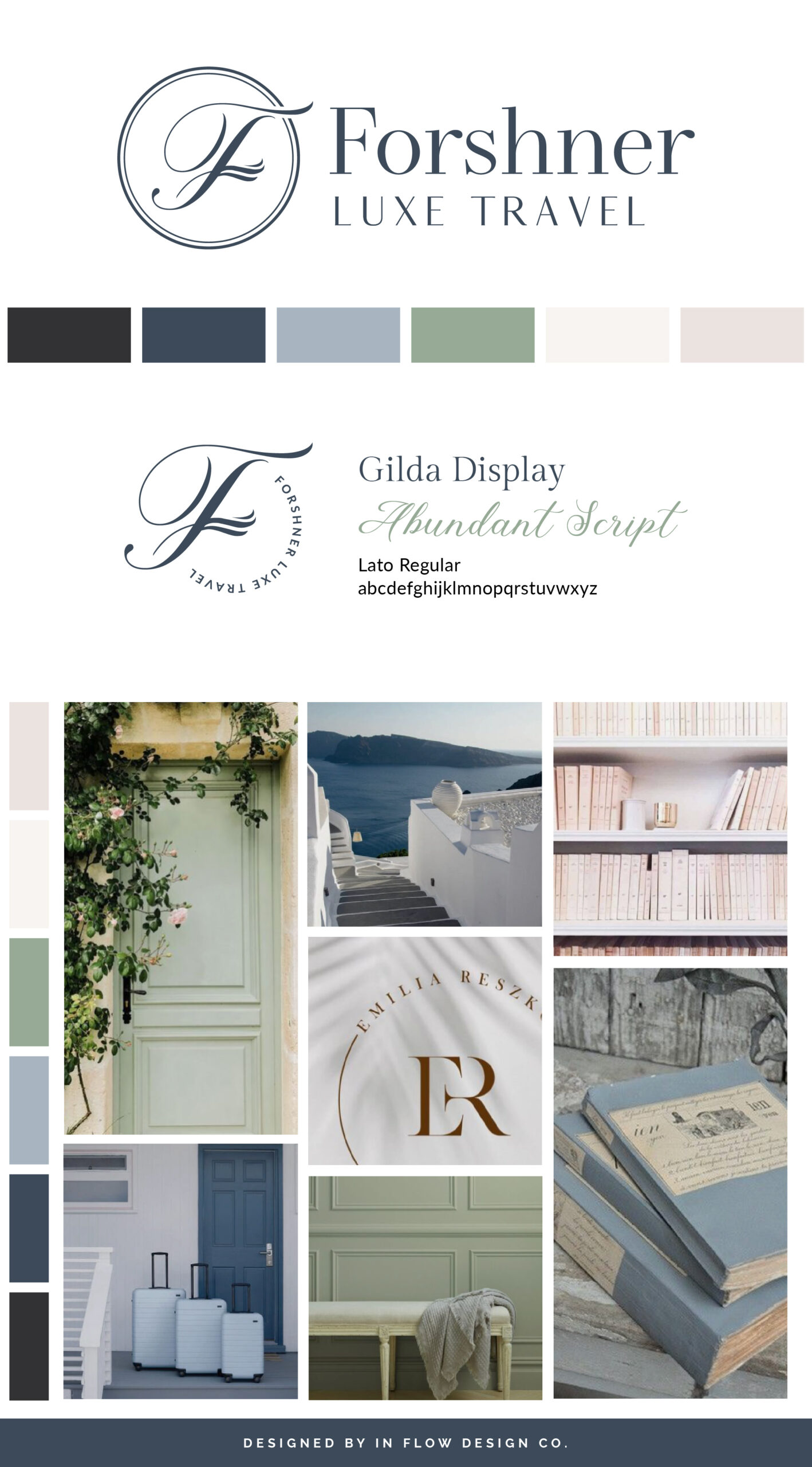
To bring her vision to life, we selected a color palette featuring shades of blue, sage, blush, and neutrals. The blues convey a professional, approachable, and timeless essence, while sage, being a green shade, symbolizes nature, growth, and freshness. A touch of blush adds a hint of femininity, and the classic neutrals balance out the blues, lending a sophisticated touch to the palette.
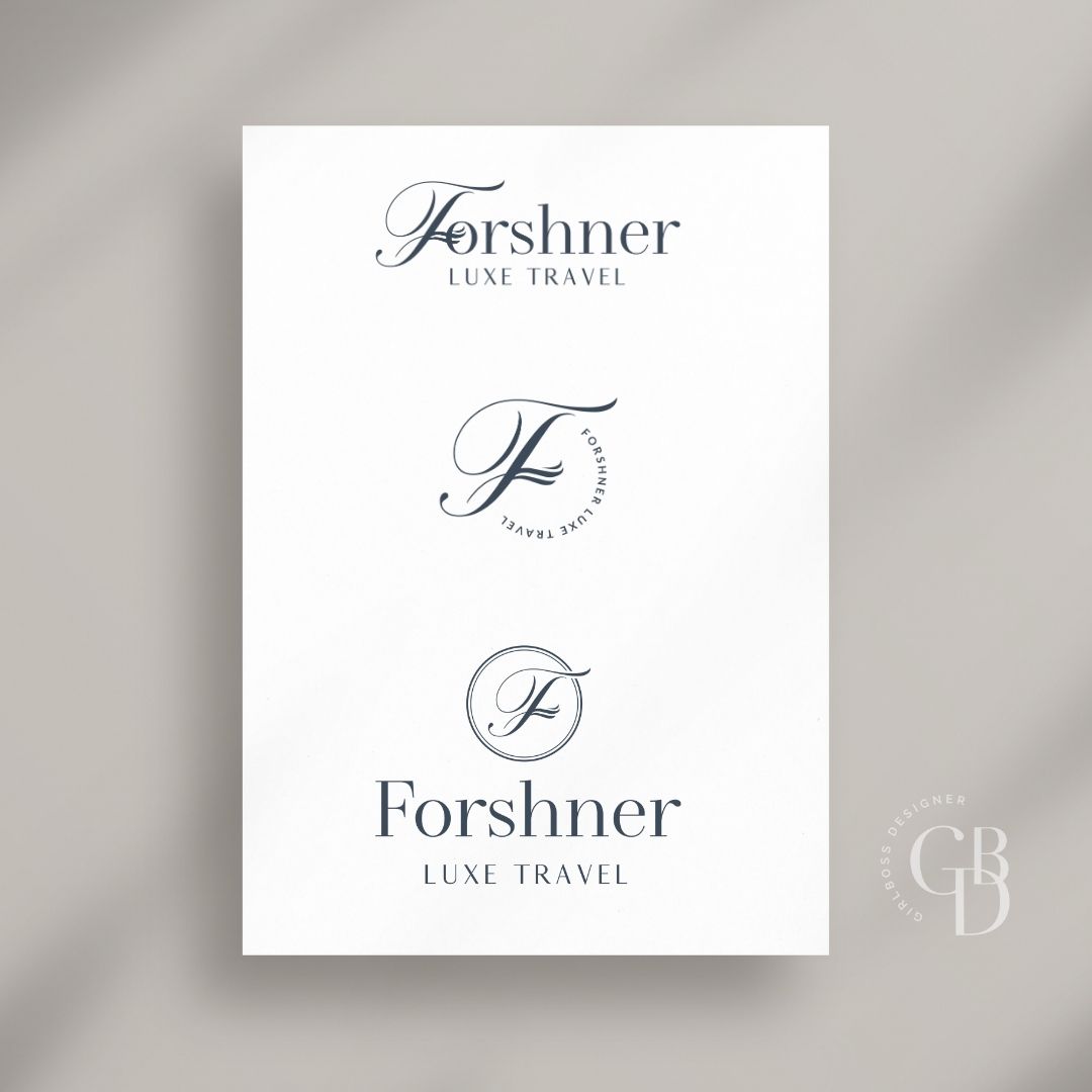
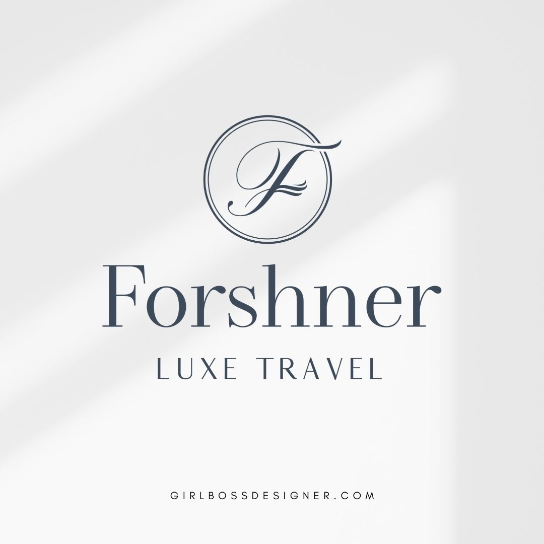
The logo showcases a monogram script “F” representing the family name, with a wing detail within the “F” that pays homage to the family’s aviation background. The serif font, with varying weights in the letters, exudes a luxurious and timeless feel. The sans-serif font below, also with varying weights, complements the serif font perfectly, maintaining the same sophisticated vibe.
Don’t forget to check out the website reveal here.
You can check out the branding and website by clicking here.


Carrie is a former flight attendant turned professional travel designer, and she started Forshner Luxe Travel to help more busy families of all sizes and life stages slow down and connect on bond-building vacations. She has always loved travel; as soon as she hears those jet engines starting, Carrie knows her next adventure is about to begin! Carrie knew early on that she wanted to make travel a central part of her life and career-and she’ve taken her family along for the ride.
Are you ready to launch that new business or elevate your current brand/website? Check out our services!
Girlboss Designer specializes in the travel industry and the online coaching industry – all serving women entrepreneurs. CLICK HERE to learn more about our services and how we can help!
