Nicole From Travel Designs By Nicole wanted her brand to have a sophisticated, approachable, classic, and timeless feel.
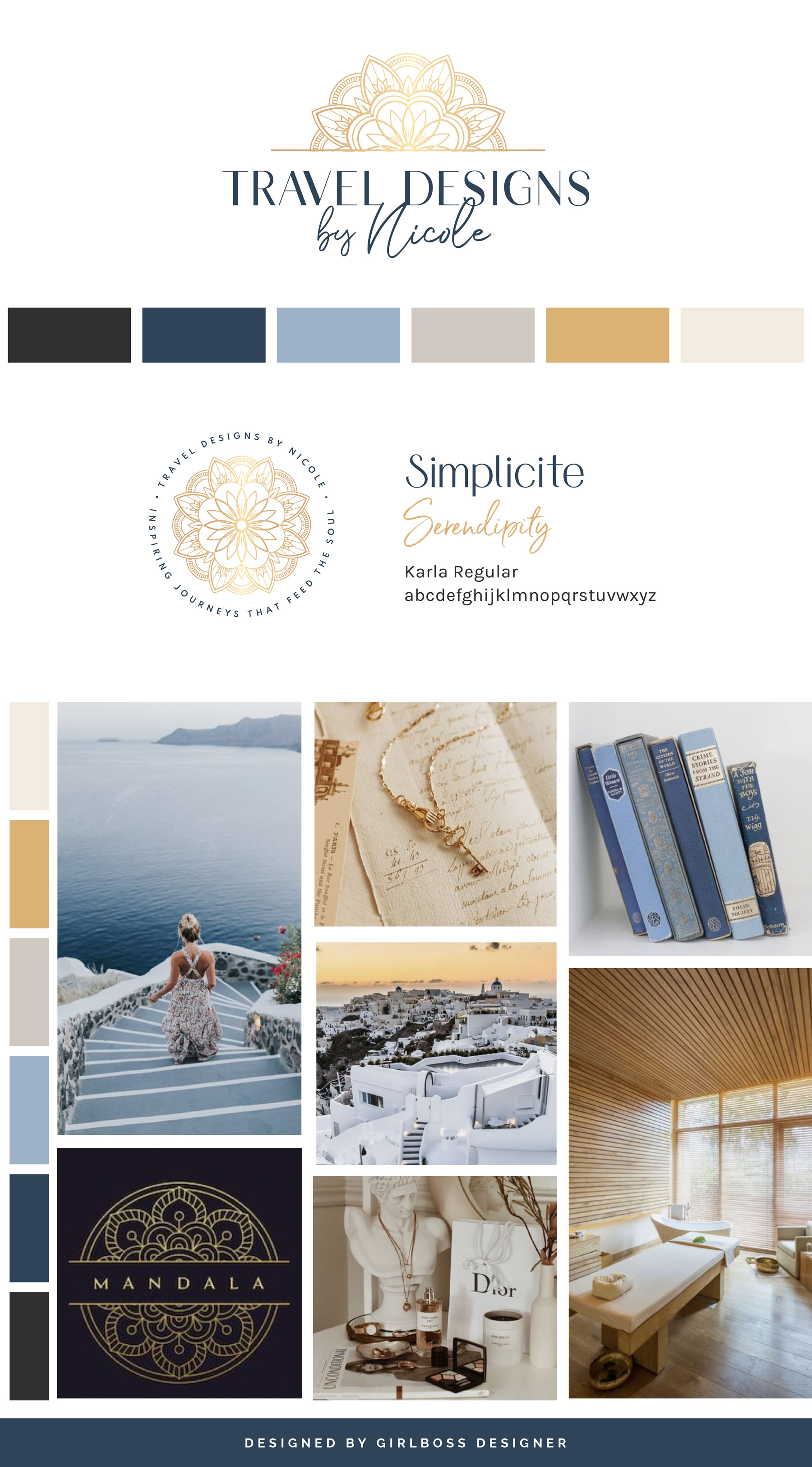
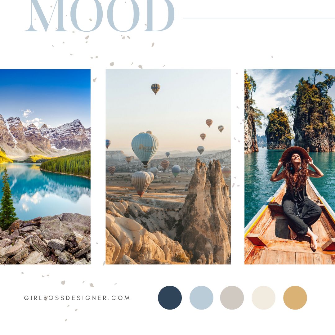
For her brand colors we went with multiple shades of blue, soft creamy neutrals, and a pop of gold. The blue gives it that timeless and professional feel while the neutrals ground the palette. The gold gives the brand that pop of boldness and confidence.
For her brand fonts we went with a san serif font with varying thickness to give it that sophisticated and high end feel.
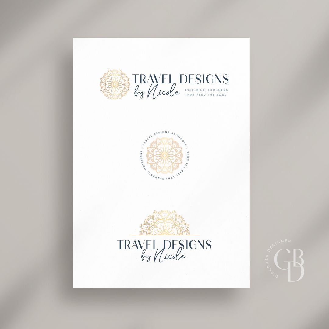
The logo features a mandala graphic element that gives it a bohemian vibe. The san serif font of Travel Designs has varying weights within the letters and that is going to give it a more sophisticated and high-end feel while still being modern. We chose a script font for Nicole because it feels like it could almost be her signature within the logo and the script we chose has a modern and chic feel to it.
Don’t forget to check out the website reveal here.
You can check out the branding and website by clicking here.


Nicole visited more than 55 countries and all seven continents around the world, and her destination expertise—along with her travel industry experience—allows her to craft itineraries that reveal the real wonders a destination holds. Nicole will put her “connector” skills to use, introducing you to the people + places that will leave a mark on you forever.
For Nicole, the best part of travel is sharing simple, meaningful moments with people throughout the world- forging human connections, sharing meals together, and swapping stories with the locals—because we all have a story to tell!
Are you ready to launch that new business or elevate your current brand/website? Check out our services!
Girlboss Designer specializes in the travel industry and the online coaching industry – all serving women entrepreneurs. CLICK HERE to learn more about our services and how we can help!
