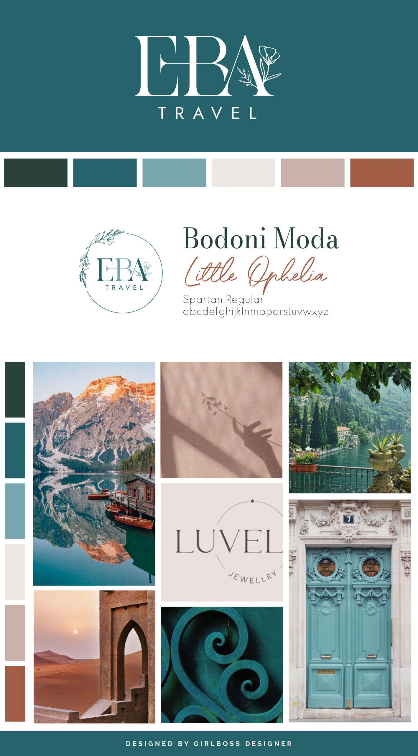
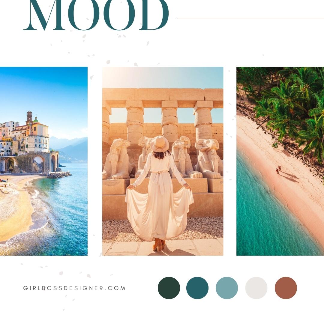
Erika, the founder of EBA Travel, aimed to create a brand that exuded professionalism, naturalness, and timelessness. Her inspiration came from colors found in nature and from beautiful destinations.
To achieve this look, we chose a color palette that included shades of teal, green, tawny, cream, and blush. Teal is associated with communication and inspiration, while green gives the brand a natural feel, associated with nature and growth. Cream and blush balance out the bolder shades and convey warmth and approachability, while tawny adds a pop of confidence to the brand.
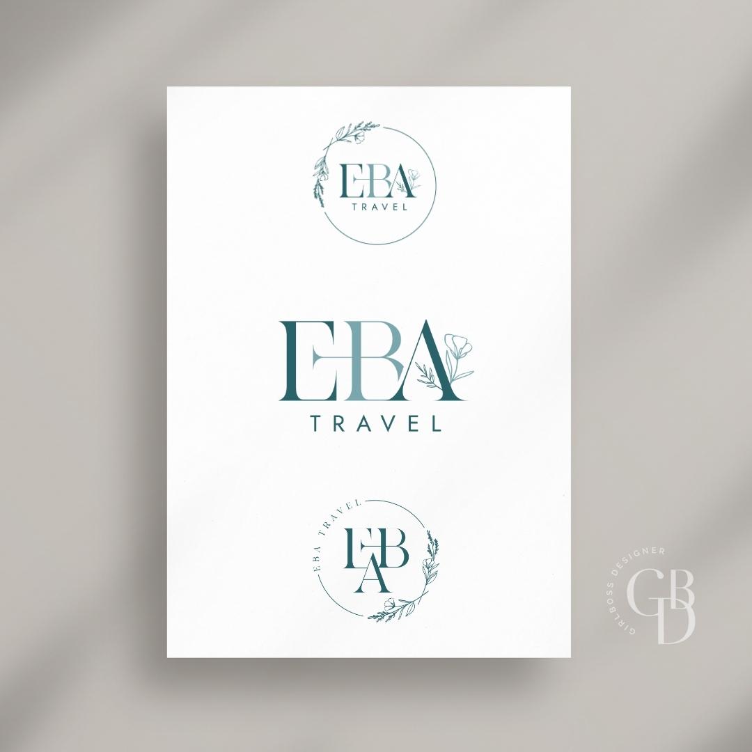
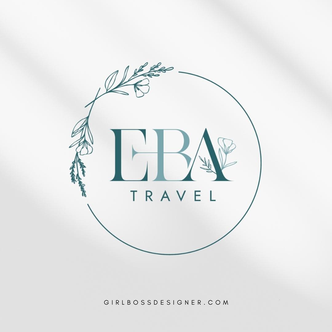
The logo has a classic and timeless design. It features unique design elements, such as the connecting E and B, and a nature-inspired design element that connects to the A. The use of a serif font with different weights gives a sophisticated touch, which is balanced by a clean and simple sans-serif font below.
Don’t forget to check out the website reveal here.
You can check out the branding and website by clicking here.
Erika is a mom to three, a total foodie, and founder of EBA Travel. As a former stay-at-home mom, she has traded in her PTA and volunteering days for days spent helping travelers make the most of their vacations.
She started EBA Travel not because she loves travel—she did it because she loves making people happy.
Are you ready to launch that new business or elevate your current brand/website? Check out our services!
Girlboss Designer specializes in the travel industry and the online coaching industry – all serving women entrepreneurs. CLICK HERE to learn more about our services and how we can help!
