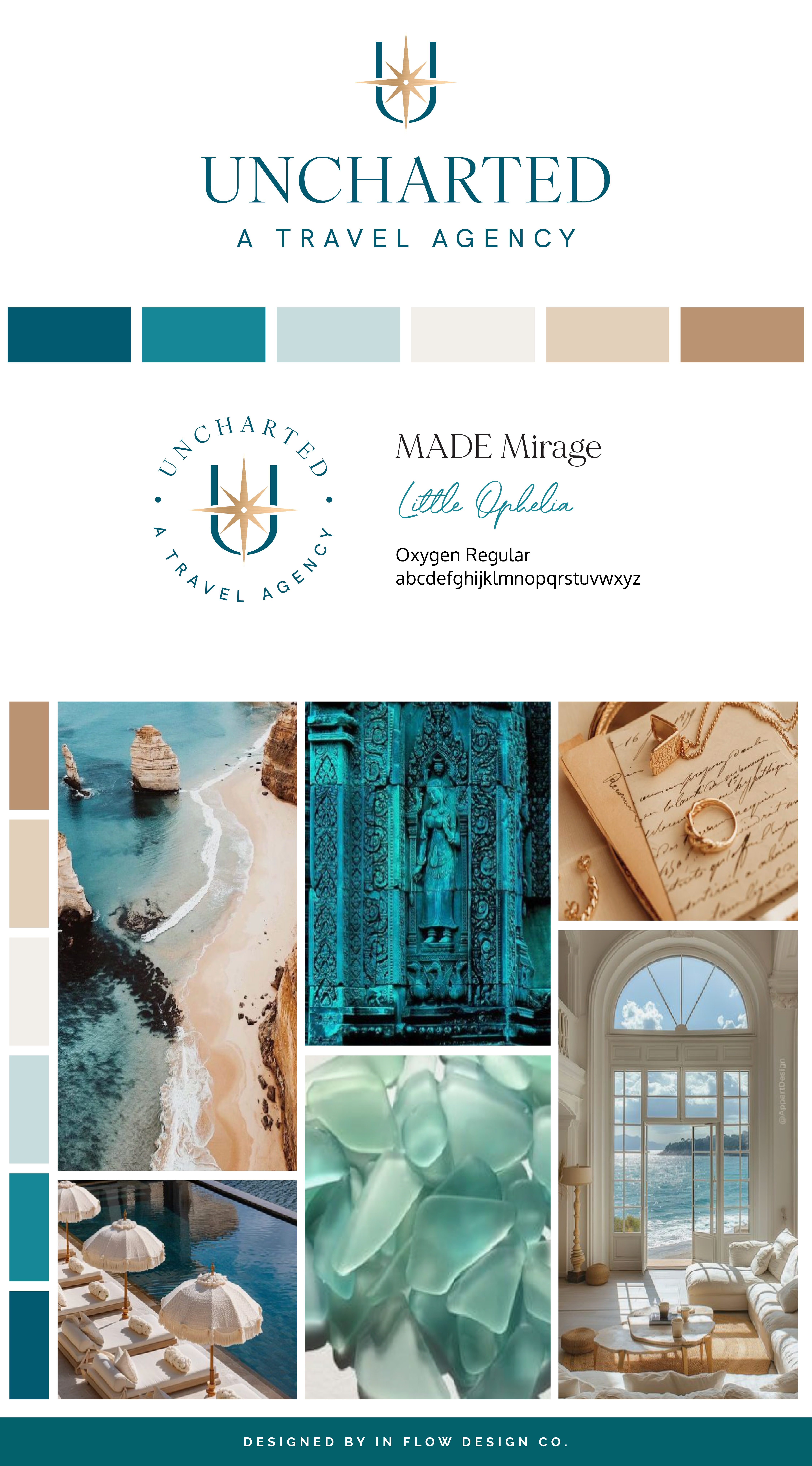
Sue, the founder of Uncharted – A Travel Agency, aimed to create a professional, luxurious, and approachable brand. She drew inspiration from the color of the sea.
To bring her vision to life, a color palette featuring multiple shades of teal, warm neutral tones, and metallic gold was chosen. The shades of teal represent communication and enhance the professional feel, while a touch of metallic gold adds luxury. The warm neutrals balance out the rich teals and create a welcoming feeling.
The logo was designed to exude a professional and confident vibe, achieved through the use of a serif font with varying weights within the letters, creating a luxurious and high-end look. To complement this, a modern and clean sans-serif font was employed for the tagline below. The compass symbol incorporates the letter U, intertwining the business name with the concept of travel.
Don’t forget to check out the website reveal here.
You can check out the branding and website by clicking here.


Over the past 27 years spent planning travel professionally, Sue honed her eye for what makes a trip unforgettable. It’s a unique combination of wish fulfillment, bringing some offbeat travel recommendations to the table, and, finally, stitching it all together seamlessly—so stress and overwhelm never make it past the boarding gate.
Today, Sue and her team work with their trusted travel partners to ensure they mix all three into every Uncharted itinerary they plan.
Are you ready to launch that new business or elevate your current brand/website? Check out our services!
Girlboss Designer specializes in the travel industry and the online coaching industry – all serving women entrepreneurs. CLICK HERE to learn more about our services and how we can help!
