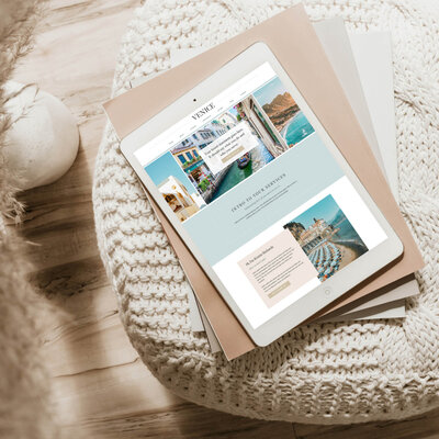


If your travel advisor website mobile experience hasn’t been reviewed, you could be missing a huge opportunity.
For most travel advisors, around 50% of website traffic is coming from mobile devices. That means half the people landing on your site are experiencing it in a completely different way than you likely designed it.
And this is where things start to break down.
Mobile optimization isn’t just about making your site “fit” on a smaller screen. It directly impacts whether someone stays, understands what you offer, and ultimately inquires.
If your mobile experience isn’t smooth, you’re not just losing traffic. You’re losing potential clients.
Why Mobile Optimization Matters for Travel Advisor Websites
Mobile users move differently.
They’re scrolling quickly, often distracted, and making faster decisions. There’s less patience and less margin for error.
On desktop, someone might take their time.
On mobile, they decide within seconds if your site feels easy or frustrating.
If anything feels off, they’re gone.
This is why your mobile experience plays such a big role in conversion. It’s not just about design, it’s about how easily someone can move through your site and take the next step.
How to Improve Your Travel Advisor Website Mobile Experience:

1. Functionality: If Something Doesn’t Work, They’re Gone
This is the fastest way to lose someone.
If your site isn’t easy to use on mobile, people won’t try to figure it out. They’ll leave and move on to the next option.
Things to check:
- Does your menu open easily and clearly?
- Are buttons large enough to tap without zooming in?
- Do all links work properly?
- Are your forms simple and functional on a phone?
Even one broken or frustrating interaction can end the experience.
If they can’t navigate your site, they’re not going to inquire.
2. Legibility: If It’s Hard to Read, They Won’t Stay
Your content should feel effortless to read on mobile.
Common issues I see:
- Font sizes that are too small
- Text that feels oversized and overwhelming
- Low contrast between text and background
- Large chunks of text that are hard to scan
Mobile is not the place for dense paragraphs or anything that requires extra effort to read.
If someone has to zoom in, slow down, or work to understand what you’re saying, they won’t stick around.
3. Spacing and Flow: Scrolling Should Feel Easy
This is one of the biggest things that gets overlooked.
Spacing that works on desktop doesn’t always translate well to mobile.
What that can look like:
- Huge gaps between sections that make the site feel disjointed
- Too much scrolling before getting to anything meaningful
- Or everything feeling cramped and cluttered
Your mobile layout should feel intentional. Each section should lead naturally into the next.
If scrolling feels annoying or disconnected, most people won’t make it far enough to actually convert.
4. Brand Visibility: First Impressions Happen Fast
On mobile, first impressions happen quickly.
If your brand doesn’t come through right away, it impacts how people perceive your business.
Look at:
- Is your logo large enough to read?
- Is it clear what you do within the first few seconds?
- Does your site feel aligned with the level of service you offer?
If your brand feels unclear or underwhelming on mobile, it’s harder to build trust.
5. Site Speed: If It’s Slow, It Doesn’t Matter How Good It Looks
This is one people don’t always think about, but it matters.
Mobile users are often not on perfect Wi-Fi. If your site takes too long to load, they may never even see your content.
Things that slow your site down:
- Large, uncompressed images
- Too many heavy design elements
- Videos or animations that aren’t optimized
You don’t need to strip your site down, but it does need to load efficiently.
6. Call-to-Action: Can They Easily Take the Next Step?
This is where everything ties together.
Even if your site looks good, if it’s not clear how to take the next step, it won’t convert.
Ask yourself:
- Is your inquiry button easy to find on mobile?
- Do users have to scroll too far to get to it?
- Are your calls to action clear and consistent throughout the site?
Your mobile experience should guide someone toward action, not make them search for it.
The Step Most People Skip
Most travel advisors design their site on desktop and leave it at that. But mobile needs its own pass.
Here’s the simplest way to approach it:
- Finish your desktop design first
- Switch to mobile view in your website editor
- Go section by section and adjust:
- Text size
- Spacing
- Image scaling
- Button placement
- Test your site directly on your phone
If you’ve never gone through your full site on mobile, you don’t actually know what your audience is experiencing.
Most people think they need more traffic to get more inquiries.
But in many cases, the issue isn’t traffic. It’s experience.
Half your visitors are already on your site.
The question is whether your mobile experience is helping them move forward or quietly pushing them away.
Action Steps
If you want to improve your mobile experience, start here:
- Open your website on your phone and scroll through it like a new visitor
- Click every link, button, and form
- Take note of anything that feels slow, confusing, or hard to read
- Go into your website editor and clean up spacing, sizing, and layout
- Make sure your inquiry button is easy to find and access
You don’t need a full redesign to improve this. Small adjustments can make a big difference in how your site performs.
Frequently Asked Questions About Mobile Optimization for Travel Advisor Websites
How do I know if my travel advisor website is mobile-friendly?
The simplest way is to open your website on your phone and go through it like a potential client.
Check that your menu works, text is easy to read, buttons are easy to tap, and your inquiry form functions properly.
If anything feels slow, hard to navigate, or frustrating, your mobile experience likely needs improvement.
What is the most important part of mobile website optimization?
Functionality comes first.
If users can’t easily navigate your site, click buttons, or submit a form, nothing else matters. After that, readability, spacing, and clear calls to action all play a role in keeping someone engaged and moving toward an inquiry.
Why does mobile experience affect website conversions?
Mobile users make faster decisions and have less patience.
If your site feels difficult to use, takes too long to load, or is hard to read, they’re more likely to leave before taking action. A smooth mobile experience makes it easier for someone to stay, understand your services, and inquire.
Should I design my website for mobile first or desktop first?
For most travel advisor websites, it’s best to design your desktop version first and then optimize for mobile.
Once your desktop layout is complete, go through your mobile version section by section to adjust spacing, text size, and layout for a smoother experience.
What are common mobile website mistakes travel advisors make?
Some of the most common issues include:
- Text that is too small or difficult to read
- Large gaps or awkward spacing between sections
- Buttons that are hard to tap
- Inquiry forms that don’t work properly
- Slow load times due to large images
- Calls to action that are hard to find
These small issues can create enough friction to prevent someone from inquiring.
How can I improve my website’s mobile experience quickly?
Start with a simple audit:
- Open your site on your phone
- Scroll through every page
- Click every button and link
- Test your inquiry form
Then go into your website editor and adjust spacing, text size, and layout where needed. Even small updates can make a noticeable difference.
Ready for a Website That Actually Converts on Mobile?
If you’re realizing your website might not be working as well as it could on mobile, you don’t have to figure it out on your own.
Whether you’re looking for a strategic refresh or a completely new site, we design travel advisor websites that are built to feel seamless on both desktop and mobile, without sacrificing the elevated, high-end look you want.
If you’re ready for a site that not only looks good but actually supports your growth, you can explore your options below: