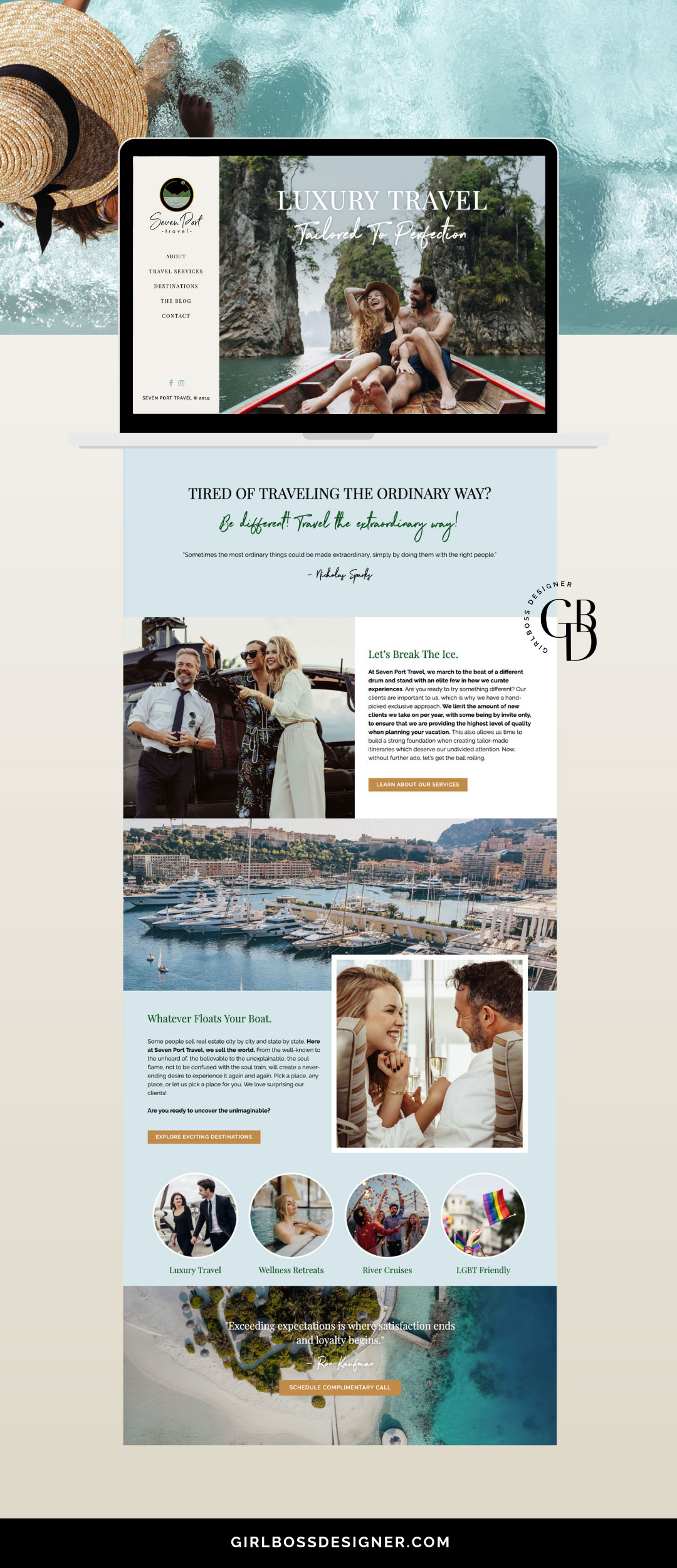
Guys… don’t tell anyone but this website for Seven Port Travel might be one of my favorites I’ve made thus far. It’s something about how the imagery, fonts, colors and layout perfectly work together where everything just feels right. I thinks it’s also because working with less saturated and more natural palette felt refreshing for me. SO freaking pretty right?!
April from Seven Port Travel already had her logo done when we got connected, and like many she had already attempted creating her WordPress website on her own. Then she realized, okay… let’s do this the smart way and hand it over to a professional! She was ready to launch her luxury travel design business with an impressive and professional look right from the start, but didn’t wait to spend FOREVER trying to learn to be a web designer on her own. Smart move April… smart move 🙂
Something I love about April is her sense of humor and quirkiness that she brings to a pretty refined looking brand. There are touches of her personality throughout this site. I love seeing my client put who they are into their brand to make it unique!

Your website is like having a sales person working for you 24/7!
It’s a big deal, so it should be looking fab but also be set up to convert into more business for you. I am typically booked a month out or so for new website clients so book your free consultation call with me to get the process started!
