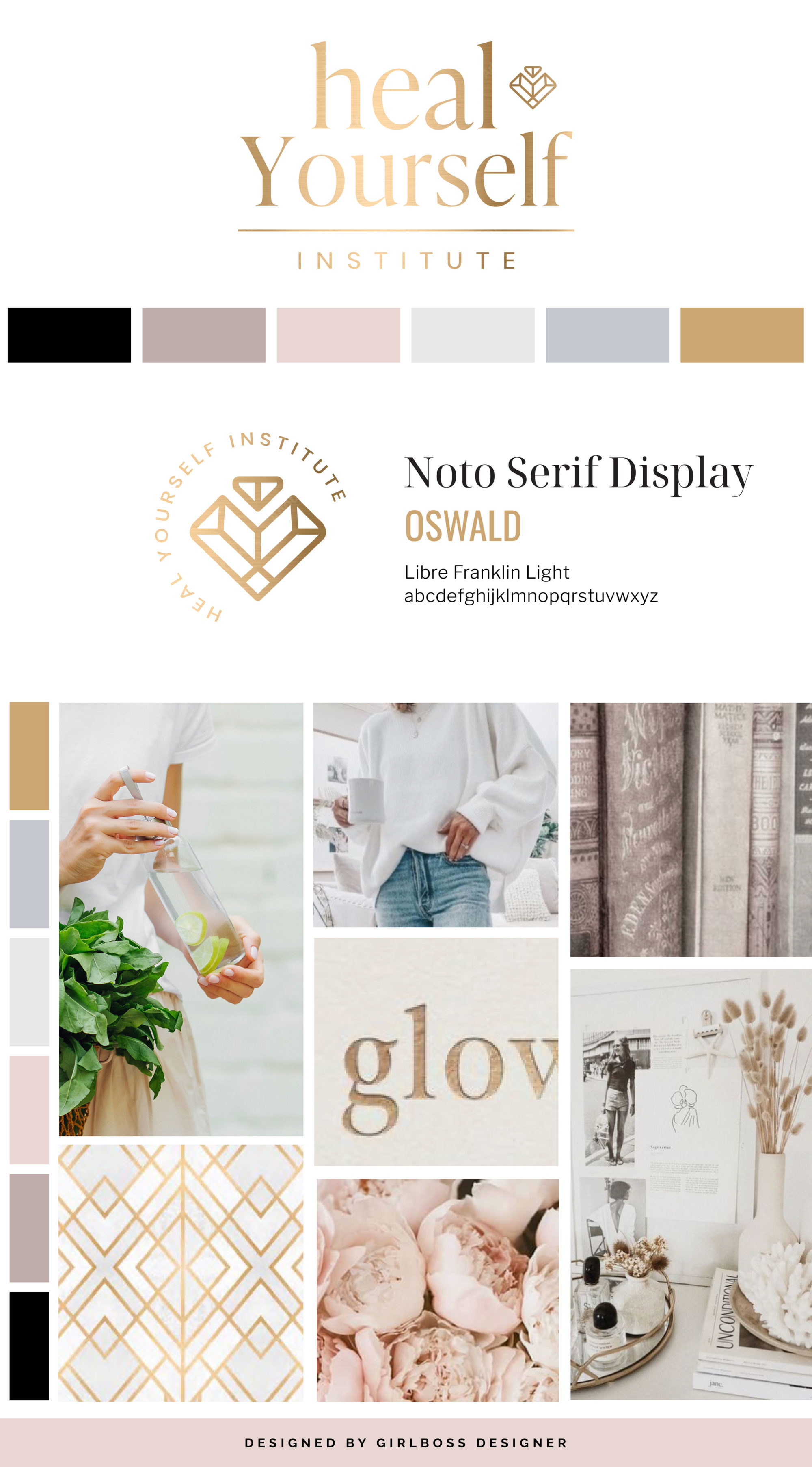
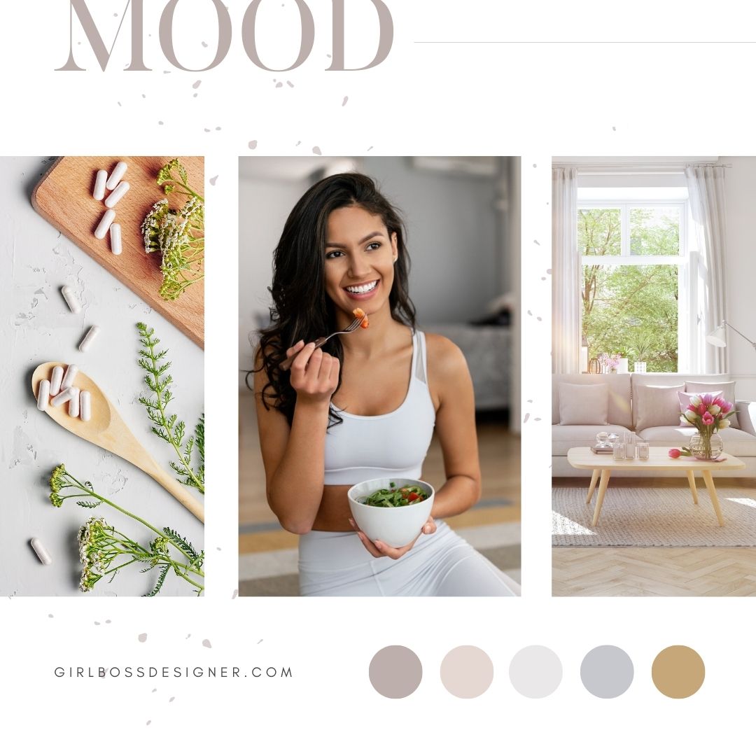
Rachel from Heal Yourself Institute wanted her rebrand to have a luxurious, natural, sophisticated, and chic feel.
For her brand colors, we went with blush, mauve, gray, black, and gold. The blush and mauve create a soft and feminine feel and the shades of gray support the airy and sophisticated feeling. The gold adds a touch of luxury and represents positivity and confidence.
For her brand fonts, we went with a serif font with varying thickness to give it that timeless and luxurious feel.
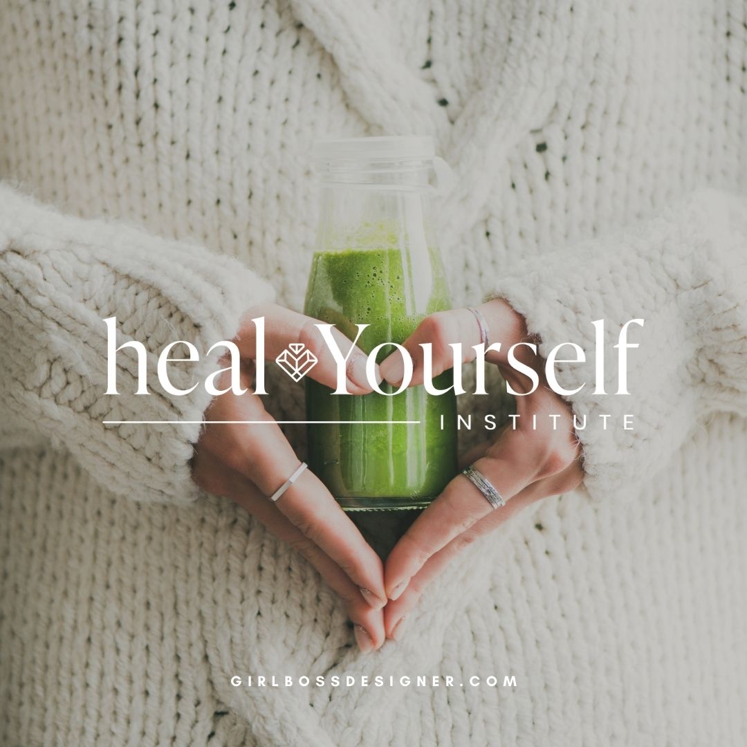
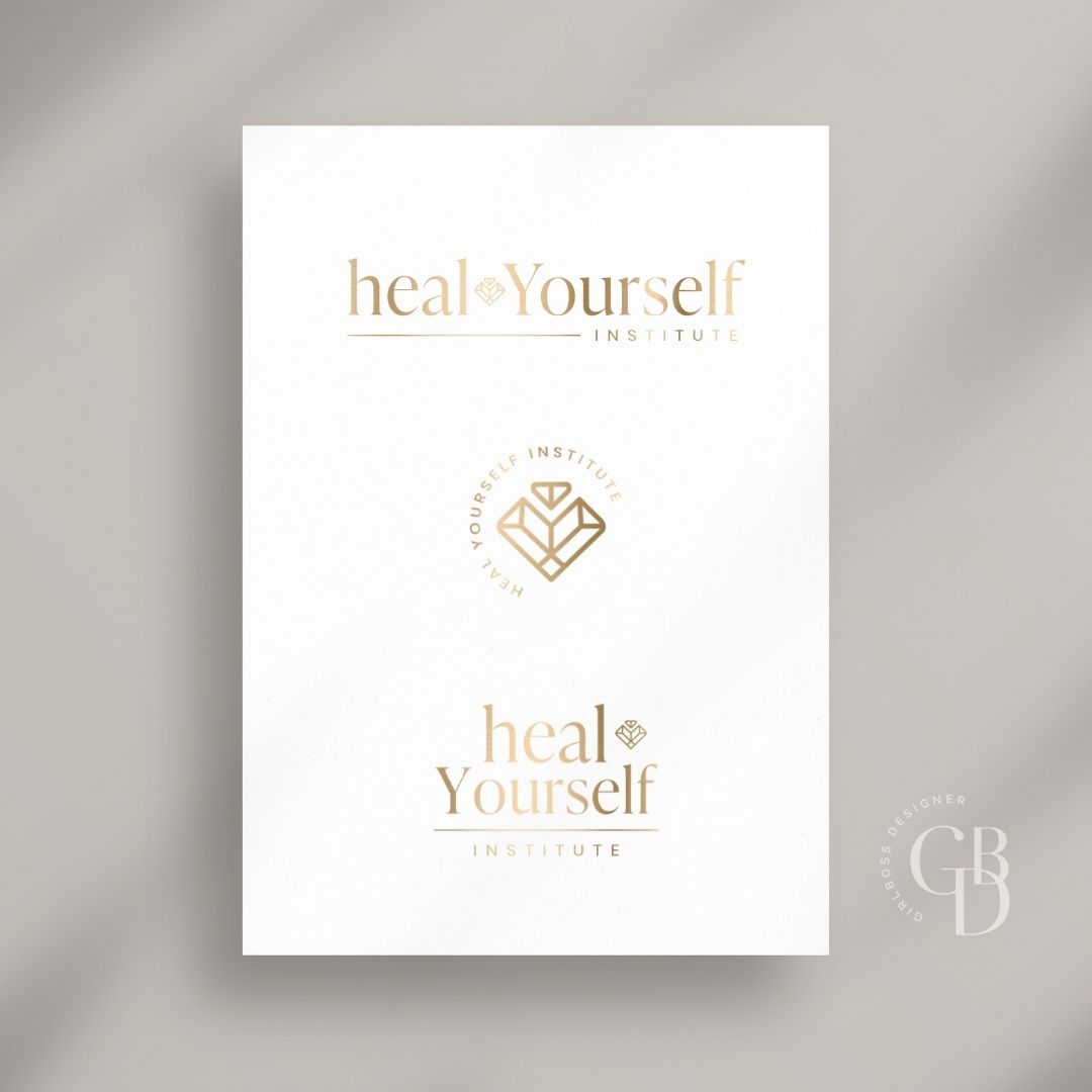
The logo is clean, simple, and timeless. The serif used for the main logo font creates a high-end sophisticated feeling, balanced by the simple san serif font below. The heart diamond combination symbol adds a unique touch to the logo.
Don’t forget to check out the website reveal here.
You can check out the branding and website by clicking here.


Rachel’s approach is simple. She engages deeply with every client she meets and customizes every program to suit their specificities. Each body is unique which is why she has spent years developing individualized strategies that lead to long-term success.
Using 100% natural healing methods, Rachel found her way back to extraordinary health and transformed her whole way of being in the process. In her private coaching & programs, you’ll work on what’s challenging you most and build simple strategies to help you break free and get back to a life you love!
Are you ready to launch that new business or elevate your current brand/website? Check out our services!
Girlboss Designer specializes in the travel industry and the online coaching industry – all serving women entrepreneurs. CLICK HERE to learn more about our services and how we can help!
