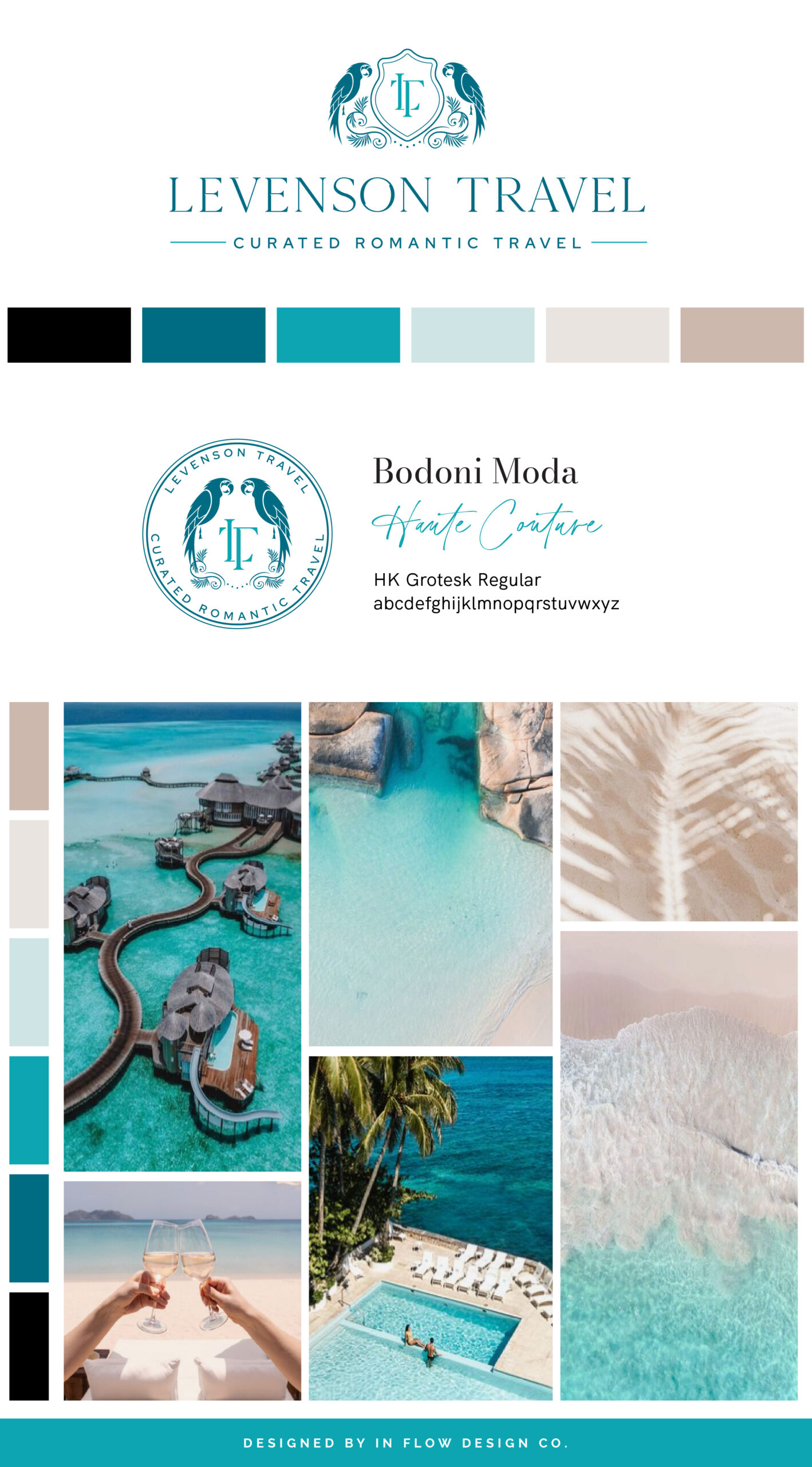
Kate, the founder of Levenson Travel, aimed to create a brand that exudes luxury and professionalism while featuring an eclectic feel. Her inspiration sprang from shades of blue, teal, and neutral colors.
To bring this vision to life, we used a color palette that includes shades of teal turquoise and a selection of classic neutrals. The teal conveys professionalism and adds a touch of luxury, while the turquoise symbolizes communication and contributes to the eclectic feel. The classic neutrals—black, cream, and taupe—serve to balance the bolder colors and enhance the overall classic vibe.
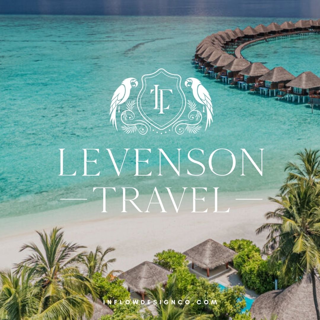
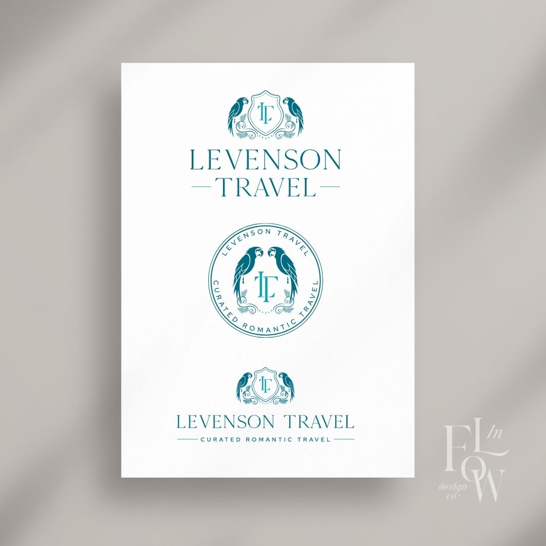
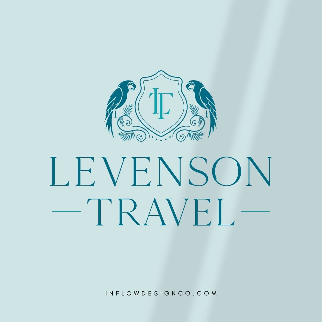
The main logo showcases a symbol with the monogram “LT” and two parrots, which represent love since Kate’s primary focus is on romantic travel. The main logo uses a serif typeface with varying weight within the letters, evoking a sense of upscale sophistication, and is complemented by a clean, modern sans-serif font for the tagline below.
Don’t forget to check out the website reveal here.
You can check out the branding and website by clicking here.


As a former teacher turned travel advisor with over 10 years of trip planning experience, Kate brings a unique blend of organizational skills, creativity, and a true love for travel to every vacation she designs. Jackie is passionate about crafting extraordinary vacations that celebrate love and connection. Whether you’re planning your honeymoon, marking an anniversary, or simply in need of a luxurious escape, she’s here to make your next adventure truly unforgettable.
Are you ready to launch that new business or elevate your current brand/website? Check out our services!
Girlboss Designer specializes in the travel industry and the online coaching industry – all serving women entrepreneurs. CLICK HERE to learn more about our services and how we can help!
