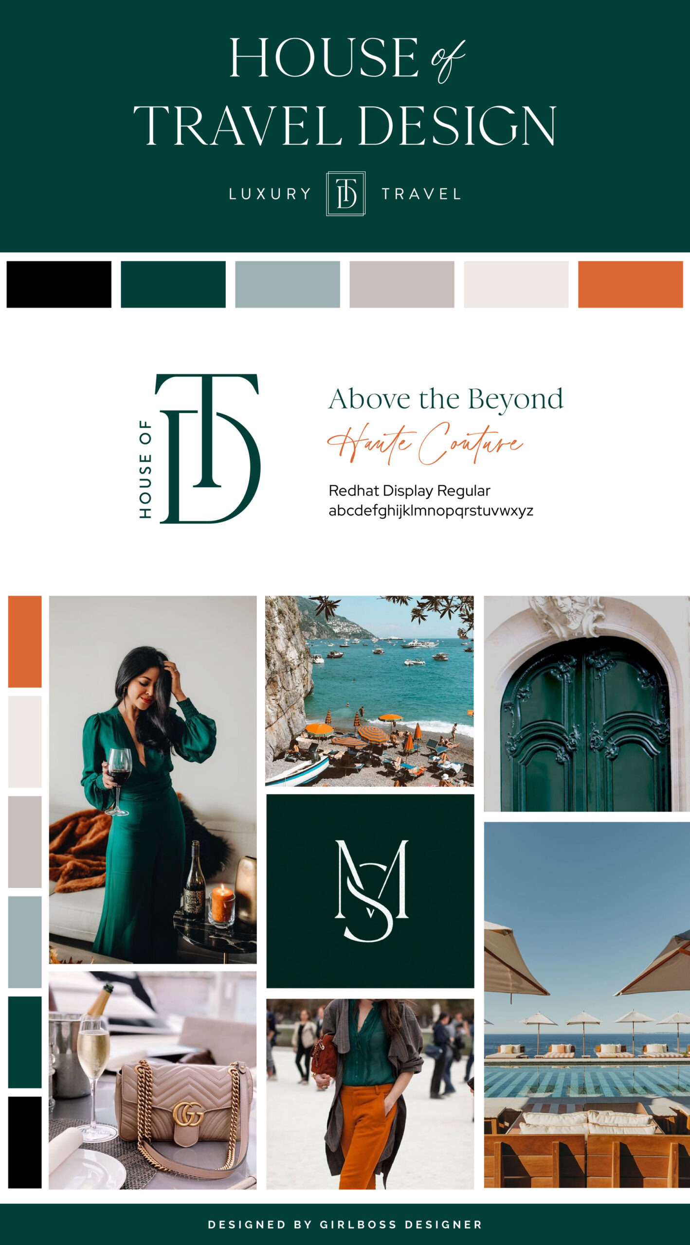
Shannon, the founder of House of Travel Design, aimed to create a brand that exuded professionalism, sophistication, and luxury. Her inspiration came from a combination of bold colors and neutral shades.
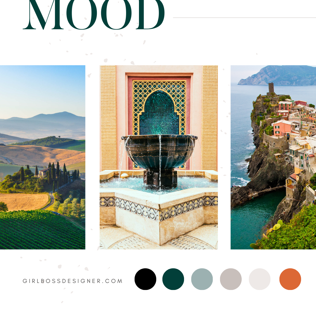
To achieve this, we utilized a color palette that included emerald green, cool neutrals, and a pop of orange. The deep emerald green adds a layer of richness and boldness to the brand. The cool neutral colors we used range from black to taupe and cream, grounding the palette and giving off a sophisticated and professional feel. The pop of orange brings a sense of vibrancy, warmth, and confidence to the brand.
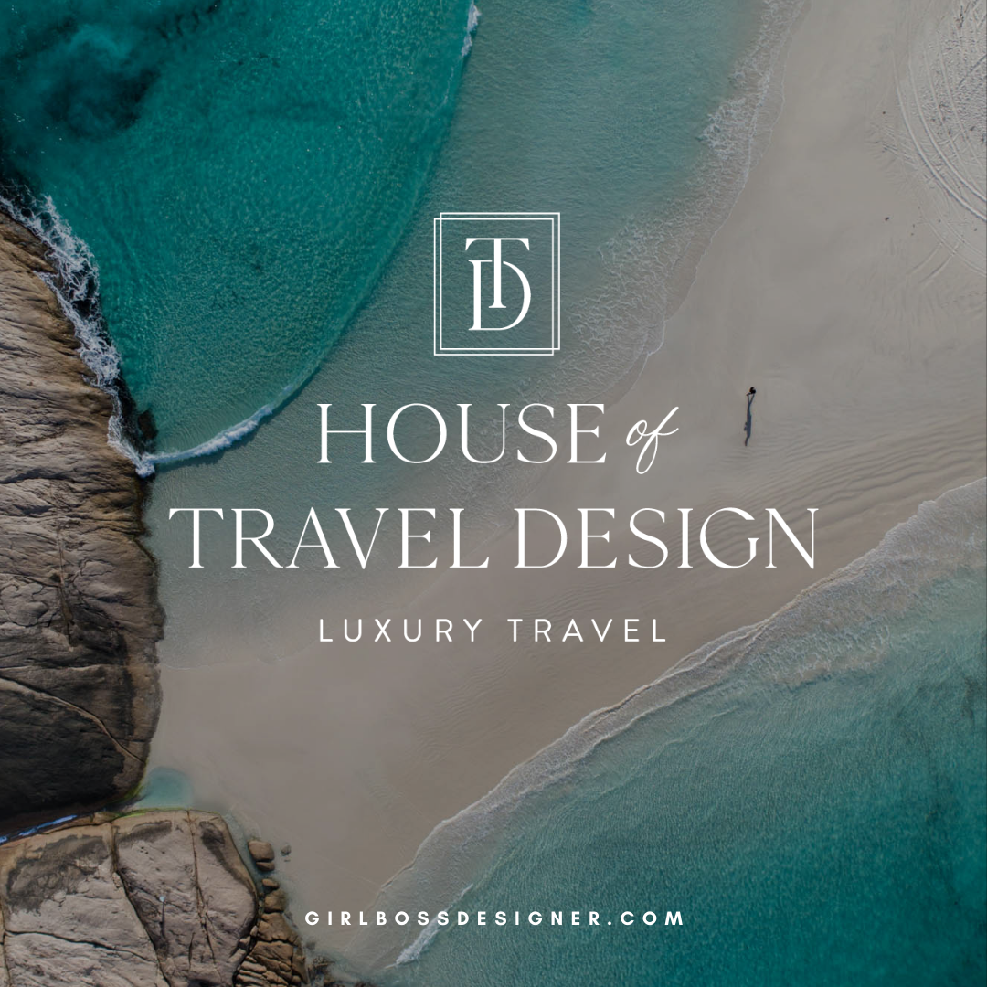
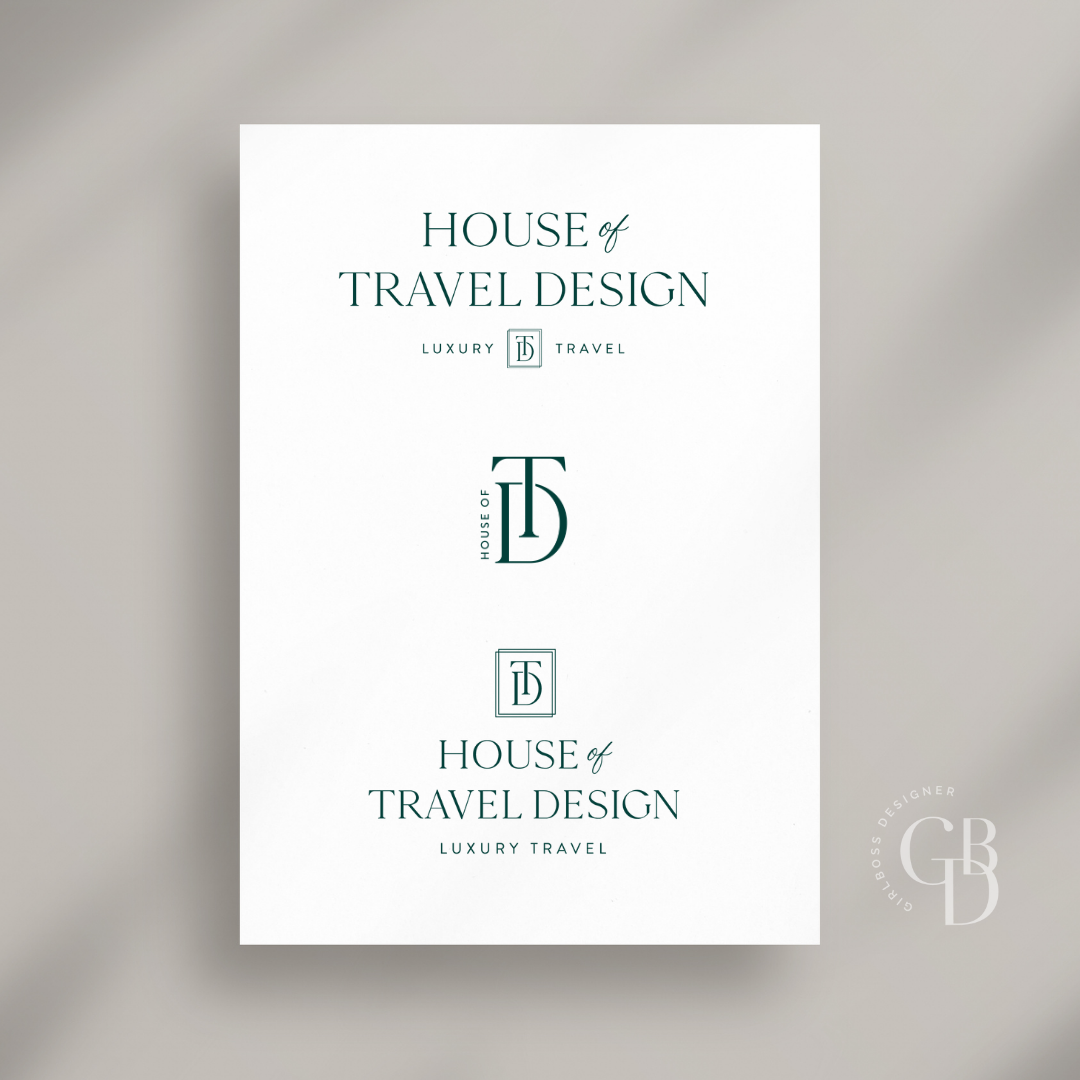
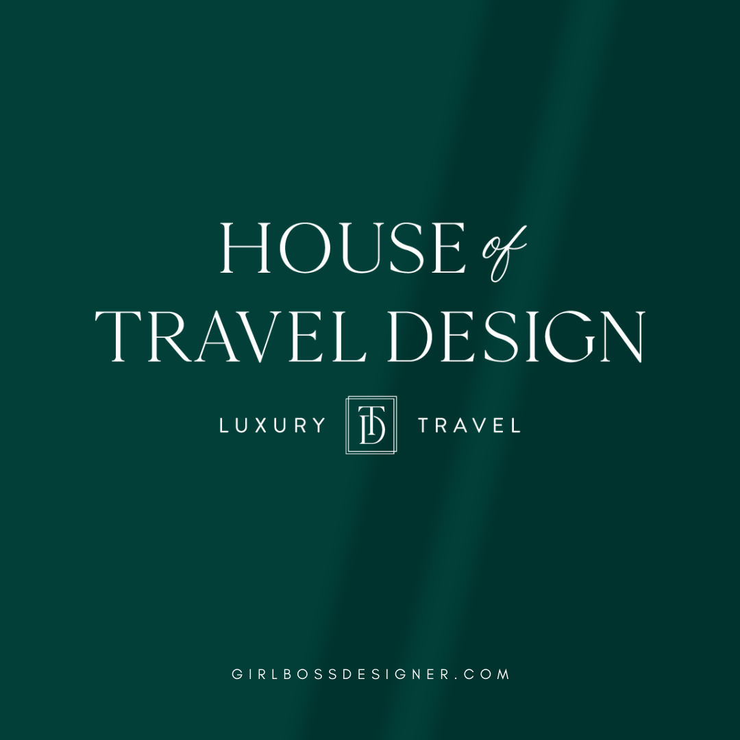
The logo is designed to look sophisticated, with a focus on typography and a small mono-gram detail. The main font used in the logo is a serif font that has varying letter weights, giving it a high-end and editorial feel. The serif font is complemented with a modern and clean sans-serif font placed below for “Luxury Travel”. We added just a touch of a script font to add small and detailed touches that create a refined and detail-oriented vibe.
Don’t forget to check out the website reveal here.
You can check out the branding and website by clicking here.
Hailing from Corporate America, an experienced project manager and successful consultant to Fortune 500 companies, Shannon Kruse blended her mind for detail with her spirit for travel like a good champagne and founded House of Travel Design to help families design their vacations.
As a mother to two teenage daughters, she knows how hard parenting can be in the Digital Age. And she knows how hard planning a trip can be. Shannon wants to make it less hard for you. She wants to make it easeful. She’ll help you and your kin disconnect to reconnect.
Are you ready to launch that new business or elevate your current brand/website? Check out our services!
Girlboss Designer specializes in the travel industry and the online coaching industry – all serving women entrepreneurs. CLICK HERE to learn more about our services and how we can help!
