


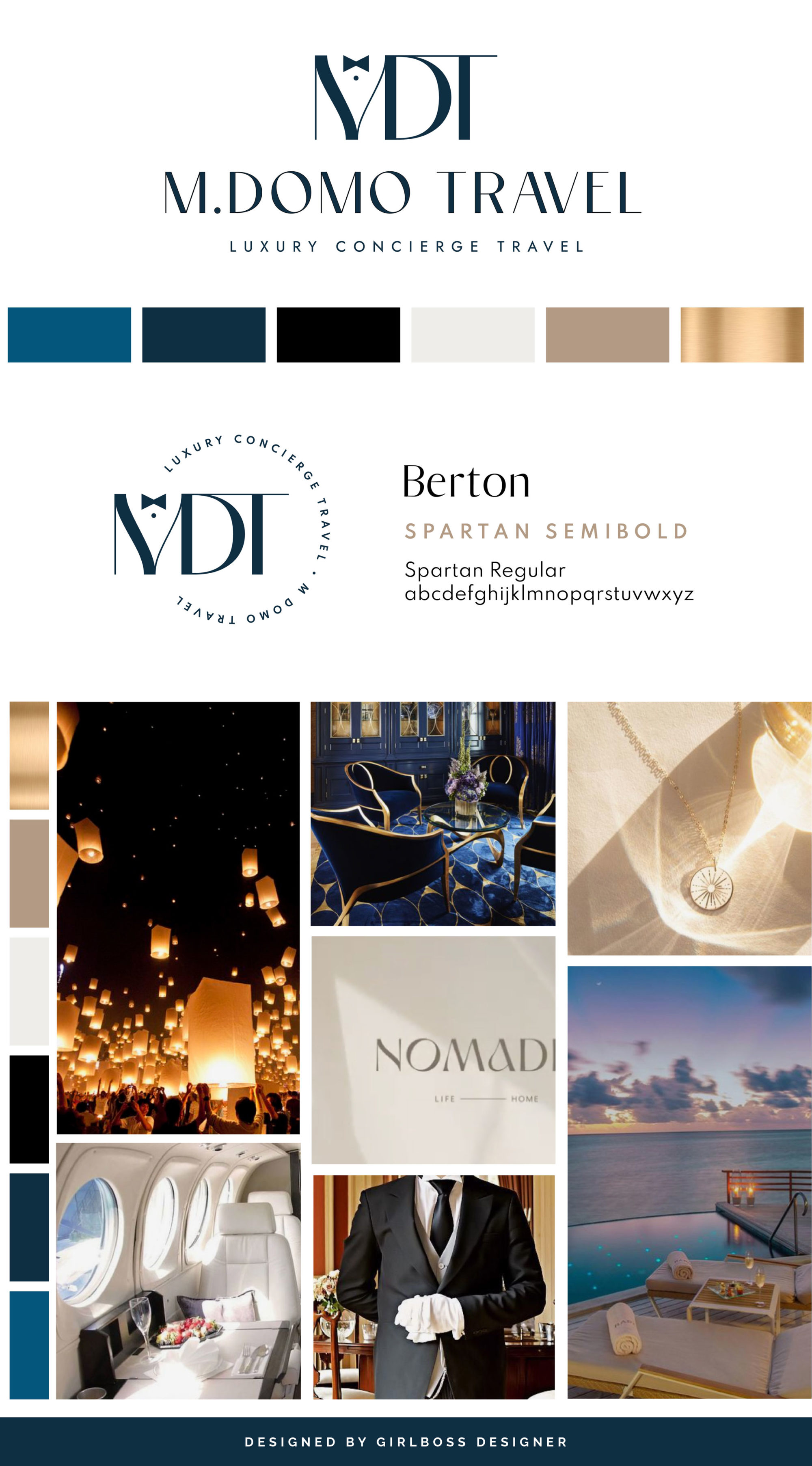
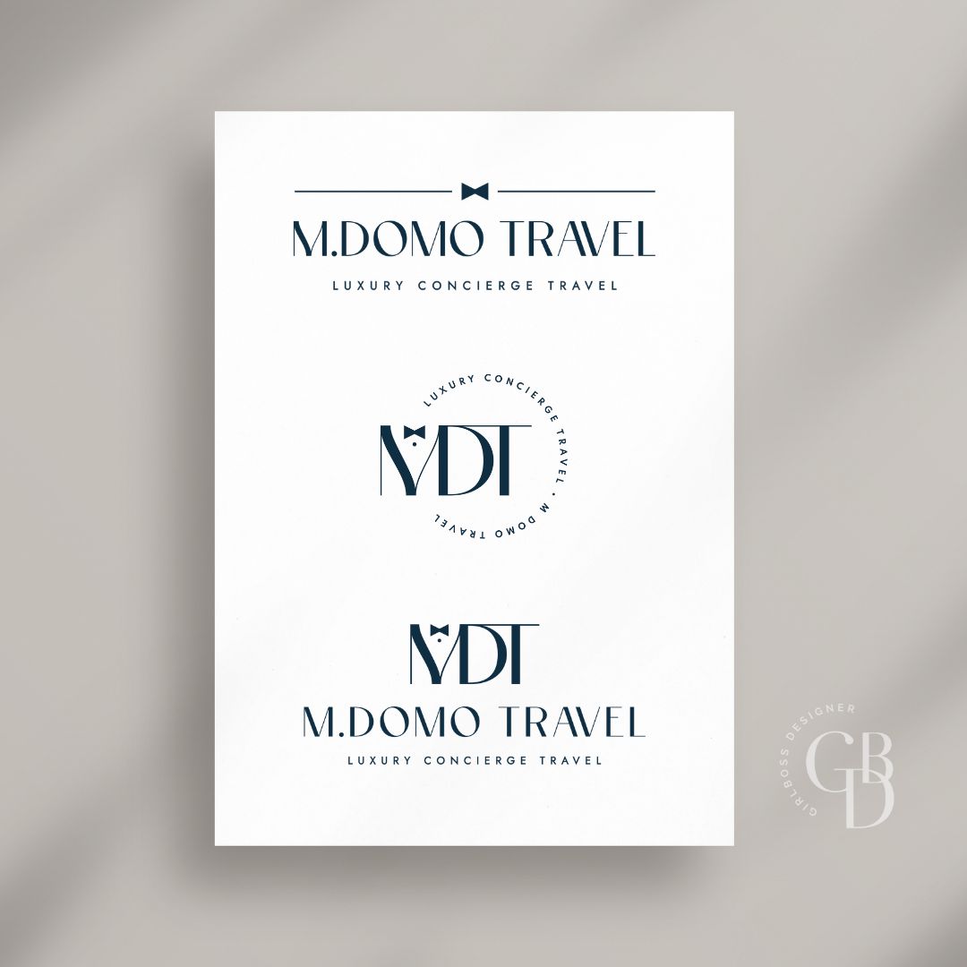
Michael from M.domo Travel wanted his brand to feel luxurious, elevated, high-end, something that catches your attention and leaves you wanting to discover more. For his brand colors we went with black, navy, and a pop of brighter blue, creamy neutrals, and just a touch of gold. The blues give the brand that sophisticated and timeless feeling while the creamy neutrals ground the darker palette while supporting the modern and high-end feeling. The touch of gold gives the brand that extra touch of luxury. The logo is sleek, high-end, and classic. The san serif for the main logo creates a high-end sophisticated feeling, balanced by a clean san serif below. The “MDT” symbol are the initials and the “M” with a bowtie creates the appearance of a suit that represents majordomo.
Don’t forget to check out the website reveal here.
You can check out the branding and website by clicking here.
Michael Torbiak founded M.domo Travel because, after years of experiencing some of the most special hotels and locations around the world, and spending hundreds of hours staying on top of every trend and nuance in the luxury travel space, he wanted to share that knowledge with his friends, family and larger community. His husband, Greg, would also tell him that his extreme attention to detail and obsession for checking things off his to-do list pre-ordained this career path for him.
Michael Torbiak founded M.domo Travel with the goal of helping other people achieve their travel goals as he achieved his.
Michael loves learning about and experiencing new destinations and sharing those with his clients and, vice versa, he relishes the opportunity to see the world through his client’s eyes.
Are you ready to launch that new business or elevate your current brand/website? Check out our services!
Girlboss Designer specializes in the travel industry and the online coaching industry – all serving women entrepreneurs. CLICK HERE to learn more about our services and how we can help!


