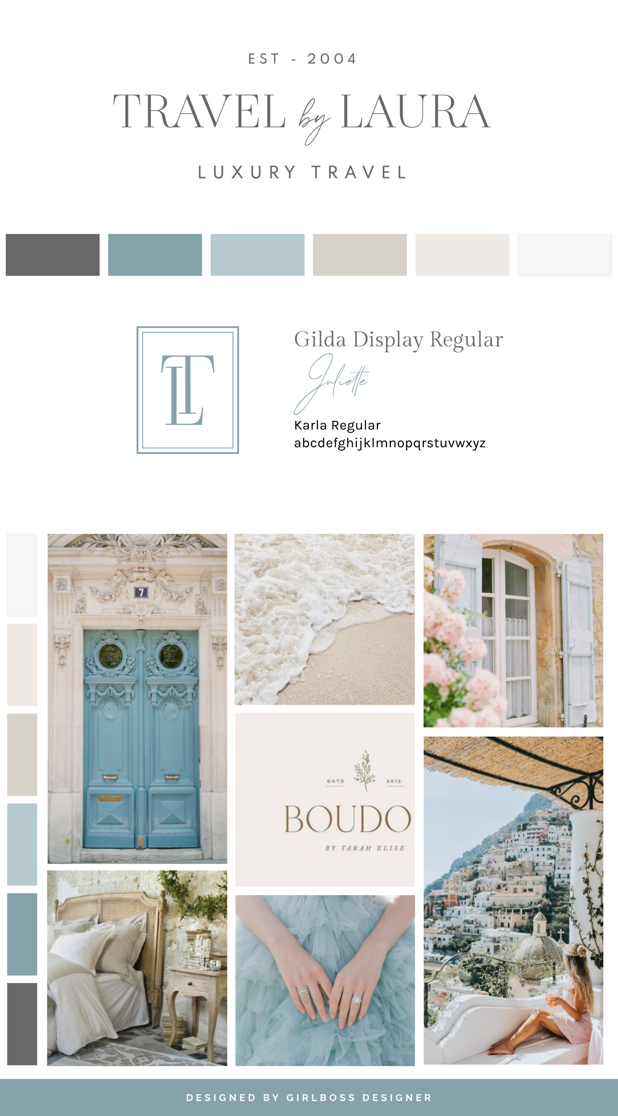
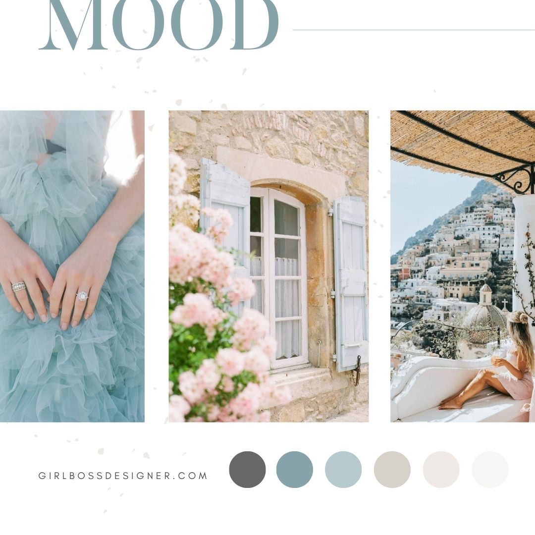
Laura, the founder of Travel by Laura, had a clear vision for her brand. She wanted it to be classic, chic, and timeless. Laura drew inspiration from soft neutral color palettes and sophisticated typography.
To achieve this goal, we have carefully chosen an elegant color palette consisting of shades of French blue, and varying neutrals from charcoal to light nudes and off-white. The blues create a welcoming and approachable feeling for the brand, as they are related to trust, communication, and peace. On the other hand, the neutral colors create a light and airy feel and give off a sophisticated and timeless vibe.
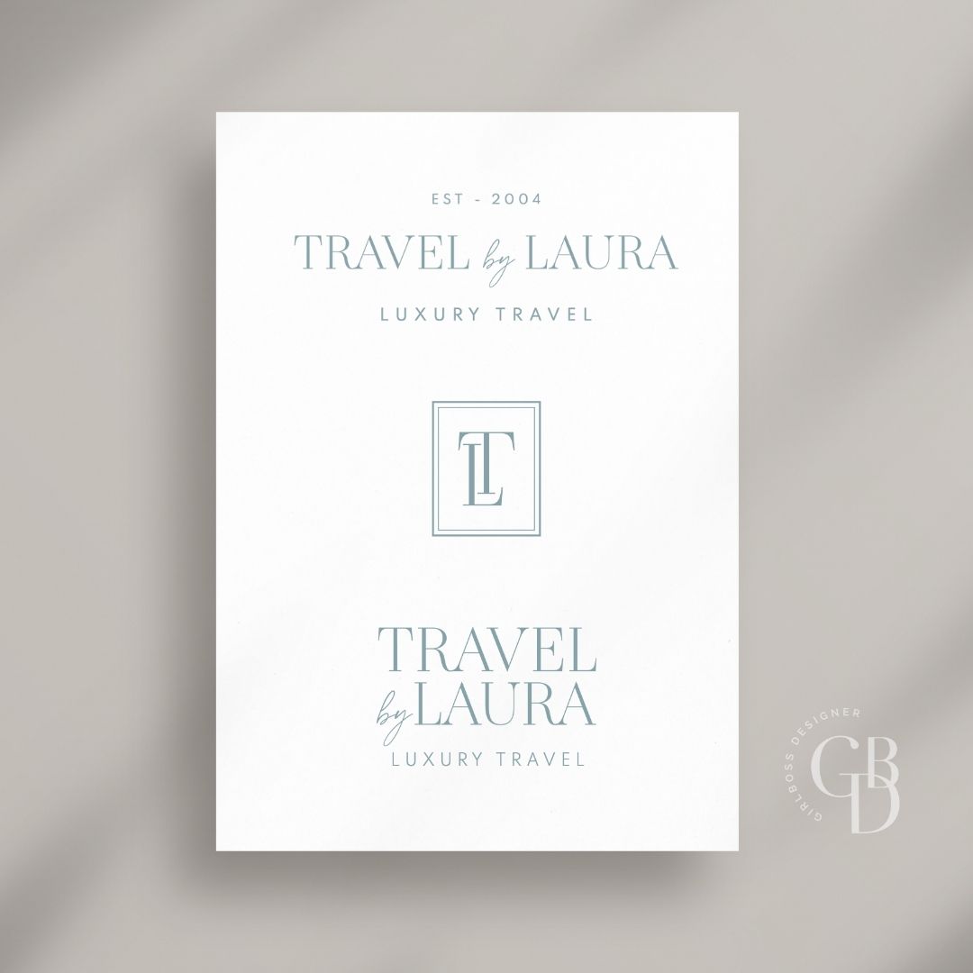
The logo we designed for the brand is sophisticated, chic, and typographic. We used a thin, feminine serif as the main font, which gives off a feeling of timelessness and has an elegant quality to it. We also added a few small detail touches, such as using a handwritten script font for “by” and highlighting the established year to showcase the years in business. All these elements work together to create a refined and detailed vibe that perfectly captures the essence of Laura’s vision for her brand.
Are you ready to launch that new business or elevate your current brand/website? Check out our services!
Girlboss Designer specializes in the travel industry and the online coaching industry – all serving women entrepreneurs. CLICK HERE to learn more about our services and how we can help!
