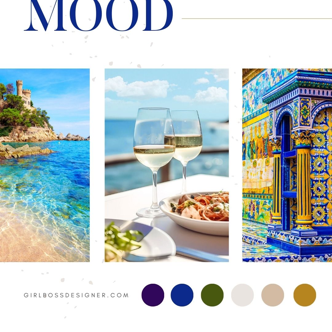
Inspired Culinary Travel was founded by Karen, with a vision to create a brand that captures the boldness and raw beauty of a National Geographic photo shoot, featuring exotic and enticing images.
To achieve this, we chose a color palette consisting of blue, green, purple, gold, and warm neutrals. Blue represents professionalism, trust, and a relaxed feeling. The bold green shade adds a natural element and creates a bohemian vibe, while the warm neutral shades balance the bolder colors and give a classic touch. The purple and gold shades add richness and luxury to the brand.
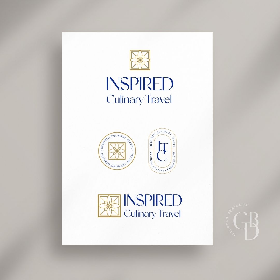
The logo has a clean, modern, and eclectic look. It uses a sans-serif font with varying weights within the letters, giving it a high-end and luxurious feel. The diamond geometric symbol features a bohemian-inspired design.
Don’t forget to check out the website reveal here.
You can check out the branding and website by clicking here.


For more than 25 years, Karen worked within the travel and hospitality industries to create seamless experiences for her clients—now she does the same through ICT, with a delicious twist.
The first half of her career was spent at major corporations (including the service-obsessed Walt Disney World) in logistical coordination and event planning roles. She tended to the travel needs of high-level executives and industry thought leaders—basically, very busy people with important places to be, and rather particular tastes.
Her job? To not only meet their needs but anticipate them—while giving them “wow” moments that spoke to their interests (this involved a bit of eavesdropping as she ferried them around the property!).
Are you ready to launch that new business or elevate your current brand/website? Check out our services!
Girlboss Designer specializes in the travel industry and the online coaching industry – all serving women entrepreneurs. CLICK HERE to learn more about our services and how we can help!
