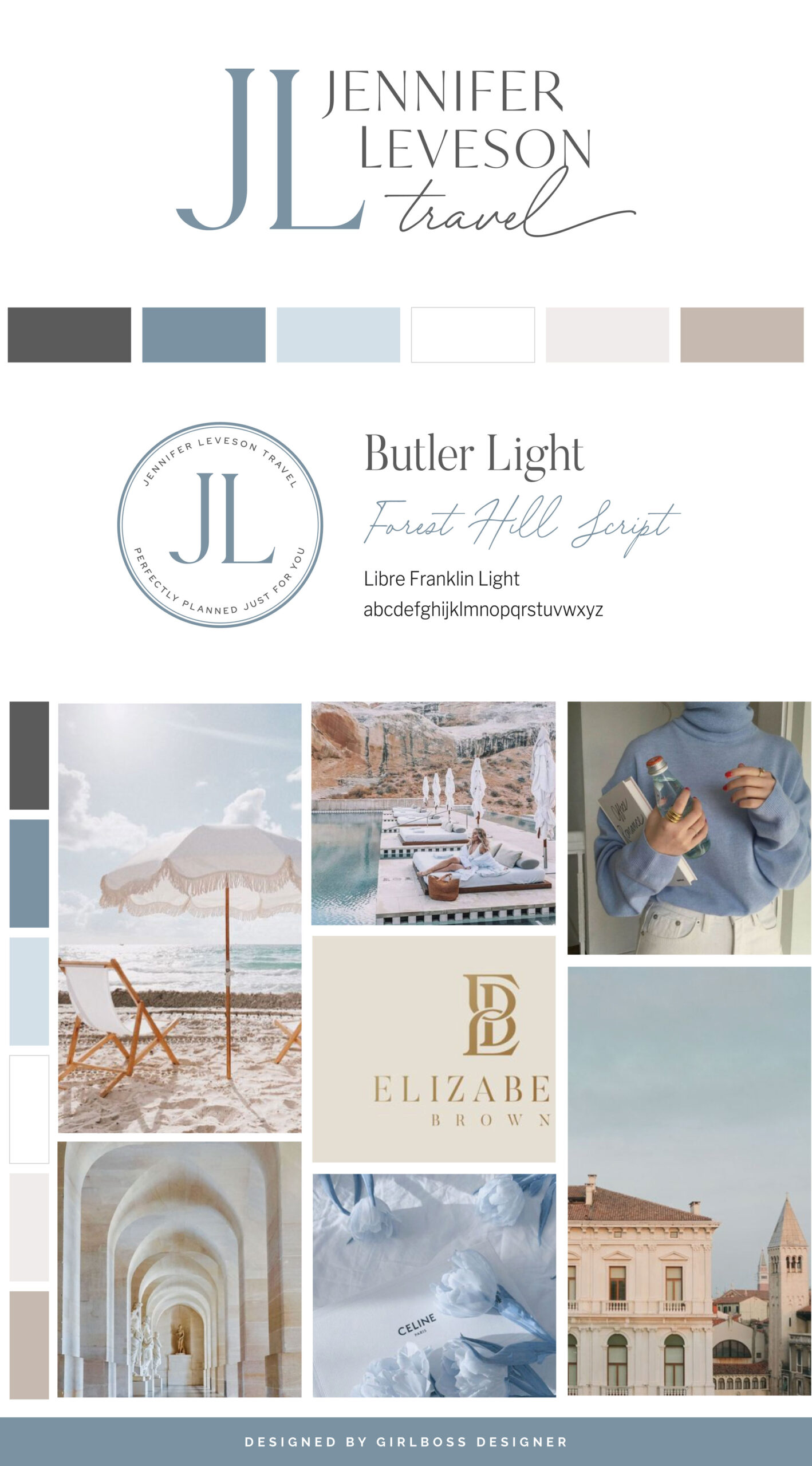
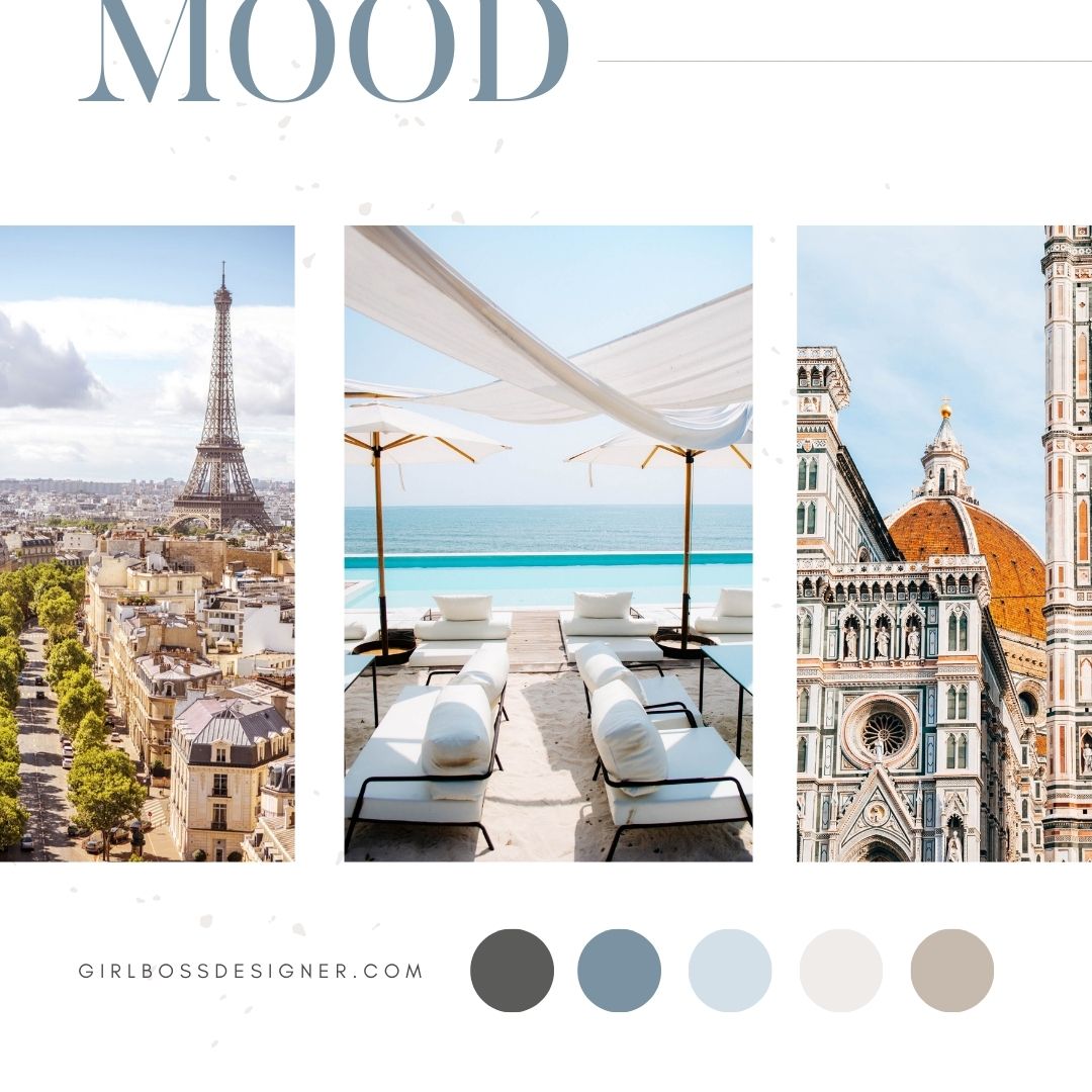
Jennifer, who is the founder of Jennifer Leveson Travel, wanted her brand to have a classic, timeless, and sophisticated look. To achieve this, she took inspiration from typography that has stood the test of time and light and airy color palettes.
We used a color palette that includes shades of blue, warm neutrals, and charcoal, which gives the brand a reliable and timeless feel. The shades of blue represent professionalism and add a sophisticated and timeless vibe. The warm neutral shades range from cream to a warm tan, which creates an approachable vibe and enhances the light and airy feel.
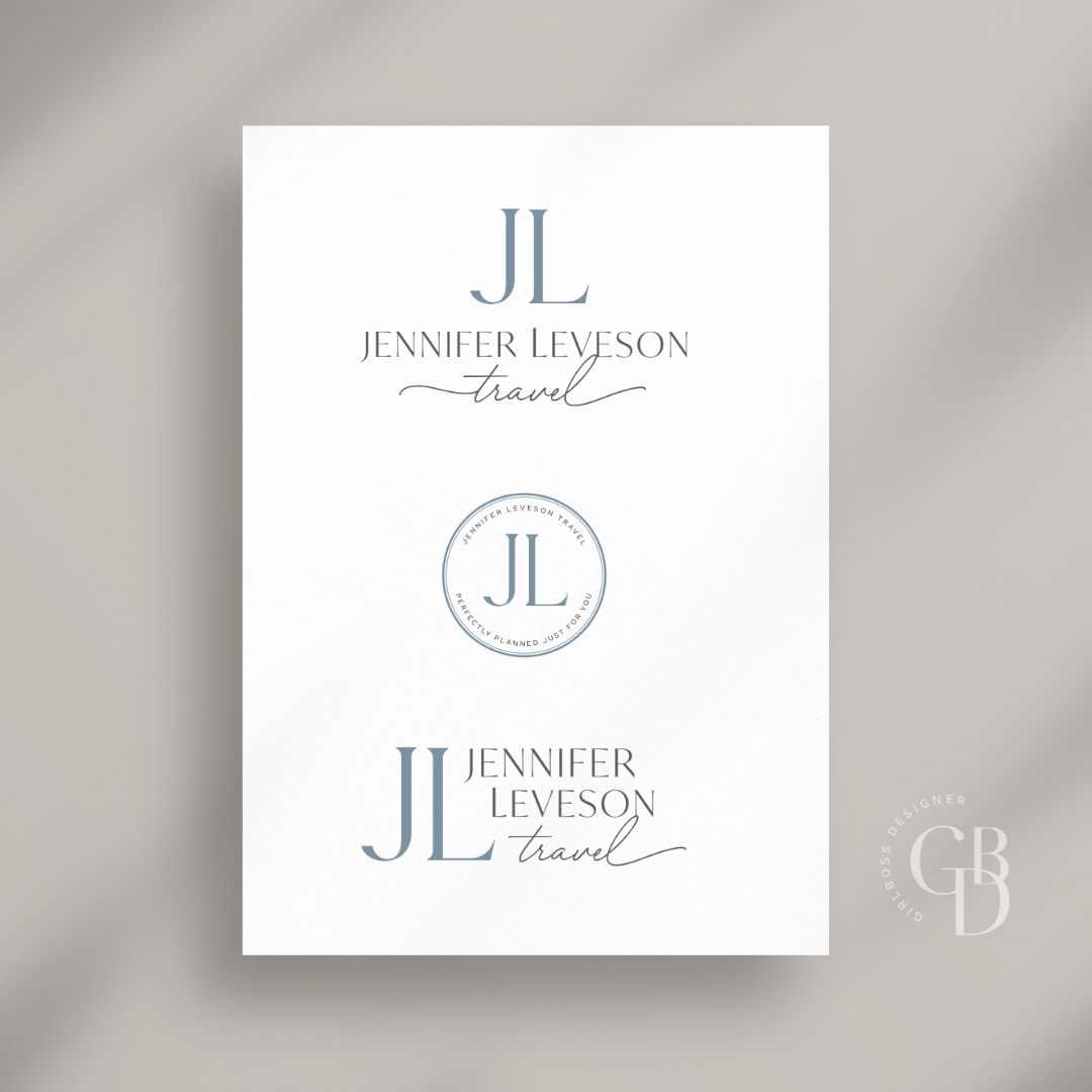
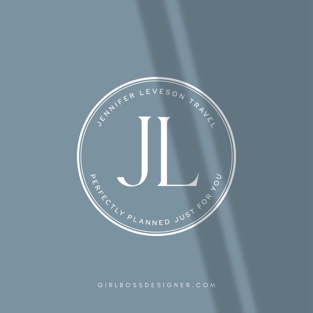
The logo has a sophisticated and timeless design that features a classic monogram symbol. The primary font used in the logo is a serif font with varying letter weights, which gives it a luxurious and traditional feel. The serif font is accompanied by a script font, which is used for the word “travel” and adds a unique touch.
Don’t forget to check out the website reveal here.
You can check out the branding and website by clicking here.
Jennifer got her first taste of European travel after getting married. While young, she traveled with her husband to Ireland, France, Spain, and beyond—and she loved every minute of it. Her mission is to inspire her clients to explore beyond their day-to-day confines and embrace the spirit of elevated adventure.
As your advisor, she makes spirited adventure accessible, unconventional journeys luxurious, and meaningful time together possible—even if you don’t have a single moment to plan it yourself.
Are you ready to launch that new business or elevate your current brand/website? Check out our services!
Girlboss Designer specializes in the travel industry and the online coaching industry – all serving women entrepreneurs. CLICK HERE to learn more about our services and how we can help!
