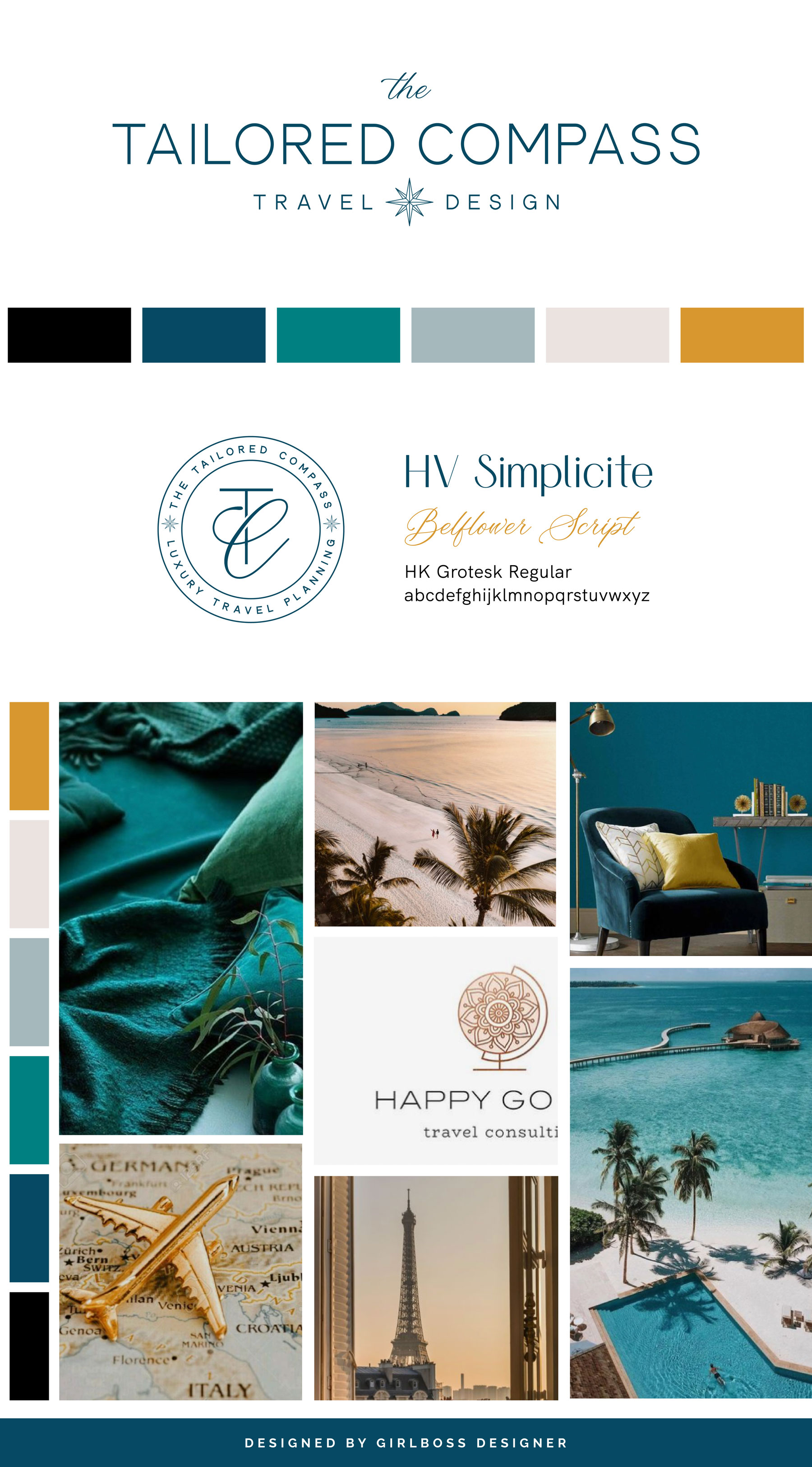
Carli from The Tailored Compass Travel Design wanted her brand to feel sophisticated, professional, laid back, modern, and luxurious.
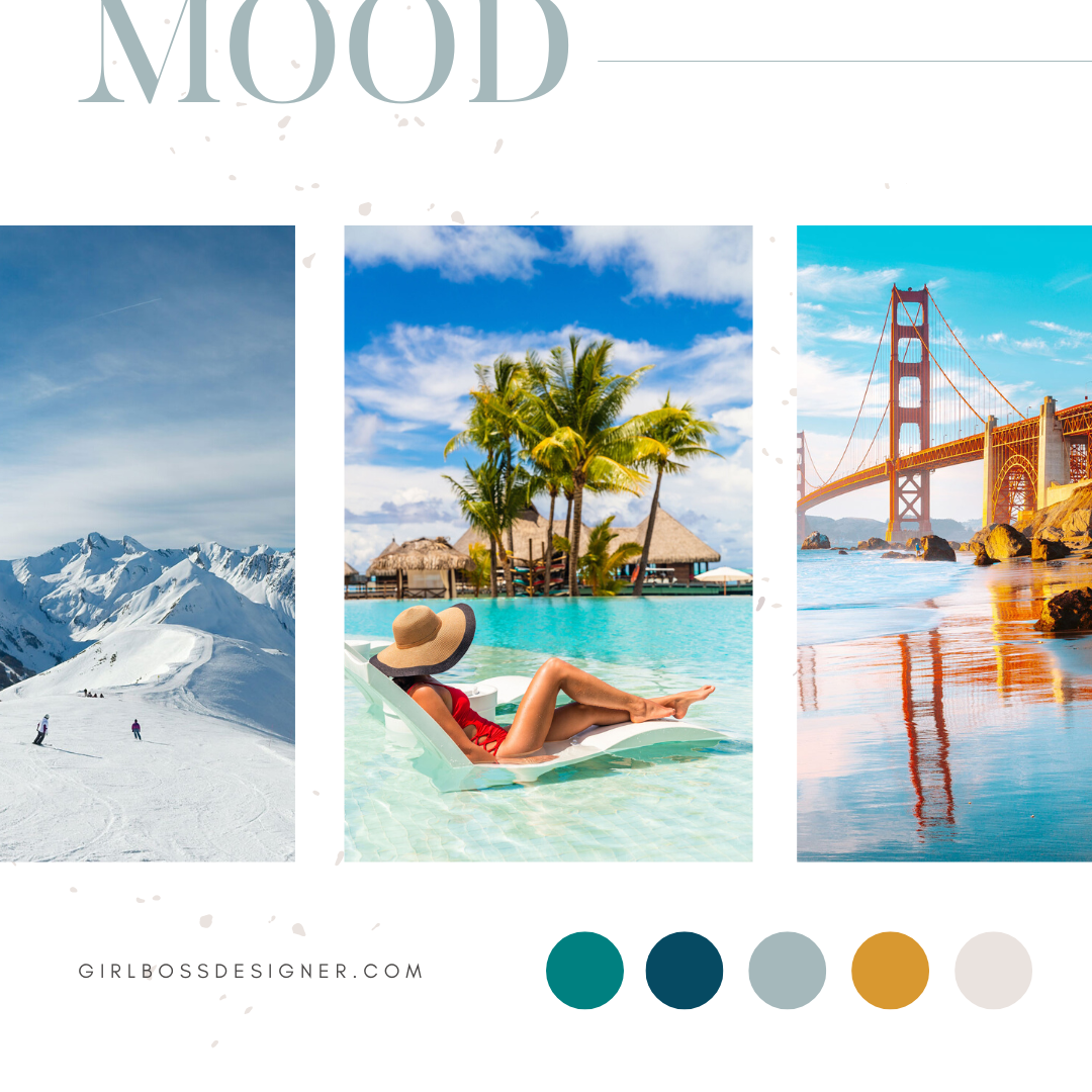
For her brand colors we went with multiple shades of blue, teal, gold and classic neutrals. The shades of blue give the brand that professional and laid-back feel. The neutrals ground the richer palette while supporting the sophisticated feel. The teal gives the brand a modern feel. Lastly, the pop of gold gives that brand a confident and luxurious feel.
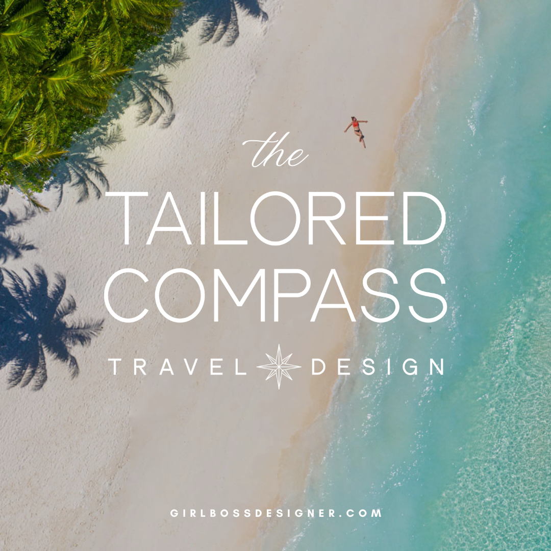
The logo features a clean, crisp san serif font that gives it that minimal yet professional and sophisticated feel along with a touch of a script font that makes it more chic. The logo features a small compass rose in the center that gives the hint of a compass reference and ties in with the name without being too literal.
Don’t forget to check out the website reveal here.
You can check out the branding and website by clicking here.


Before founding her travel agency, Carli spent two decades in the non-profit space, where she would listen to donors’ dreams and then spin that into the perfect proposal. Her move from donor lists to bucket lists was sparked by a simple realization: Travel is essential for bringing families together.
With a demanding career, an equally overworked husband, and five kids at home, Carli was juggling a lot. Quality together time was hard to come by; in fact, one of the few ways they did get to simply enjoy time together as a family was on vacation when they left all the homework deadlines and work duties behind. So, Carli became determined to make the most of their vacation time together.
Are you ready to launch that new business or elevate your current brand/website? Check out our services!
Girlboss Designer specializes in the travel industry and the online coaching industry – all serving women entrepreneurs. CLICK HERE to learn more about our services and how we can help!
