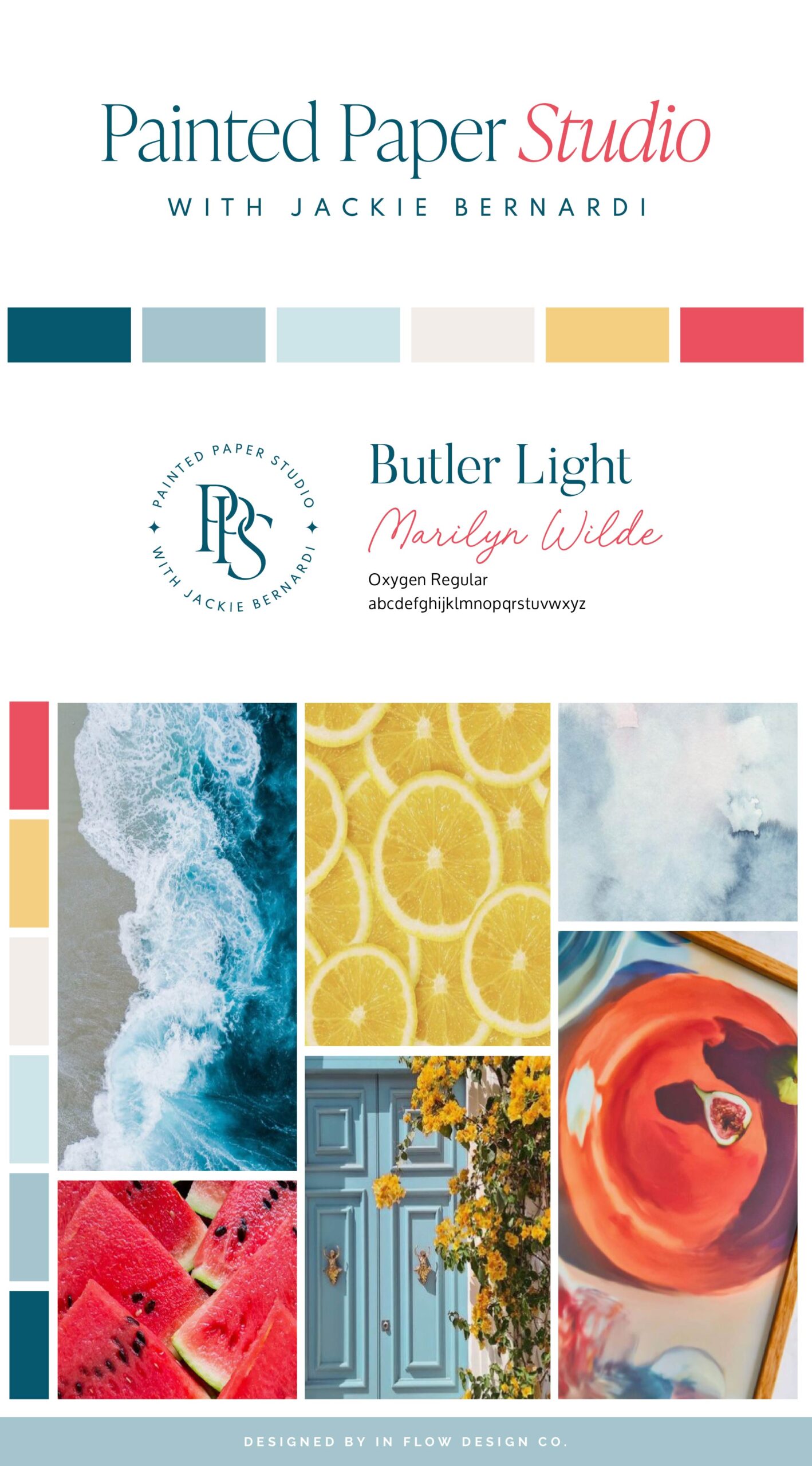
Jackie, the founder of Painted Paper Studio, envisioned a brand that combines a confident aesthetic with a welcoming and energetic vibe. She drew design inspiration from bright citrus colors.
To bring her vision to life, we selected a color palette featuring various shades of blue, yellow, red-orange, and classic neutrals. The blue shades evoke professionalism and provide a classic feel, while the yellow and red-orange add a punch of confidence, creating a bold and vibrant energy for the brand. The classic black and cream neutrals help balance the bolder colors.
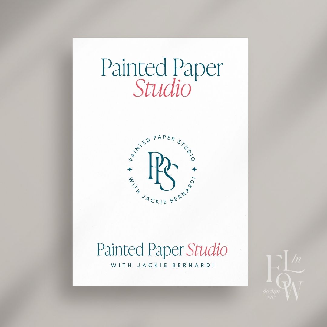
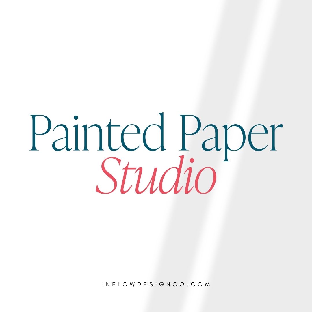
The logo was designed to be both welcoming and typographic. The main logo font is a serif typeface with varying letter weights, complemented by an italic font that adds a sophisticated yet casual feel. This is balanced by a clean and modern sans-serif font for the tagline below.
Don’t forget to check out the website reveal here.
You can check out the branding and website by clicking here.


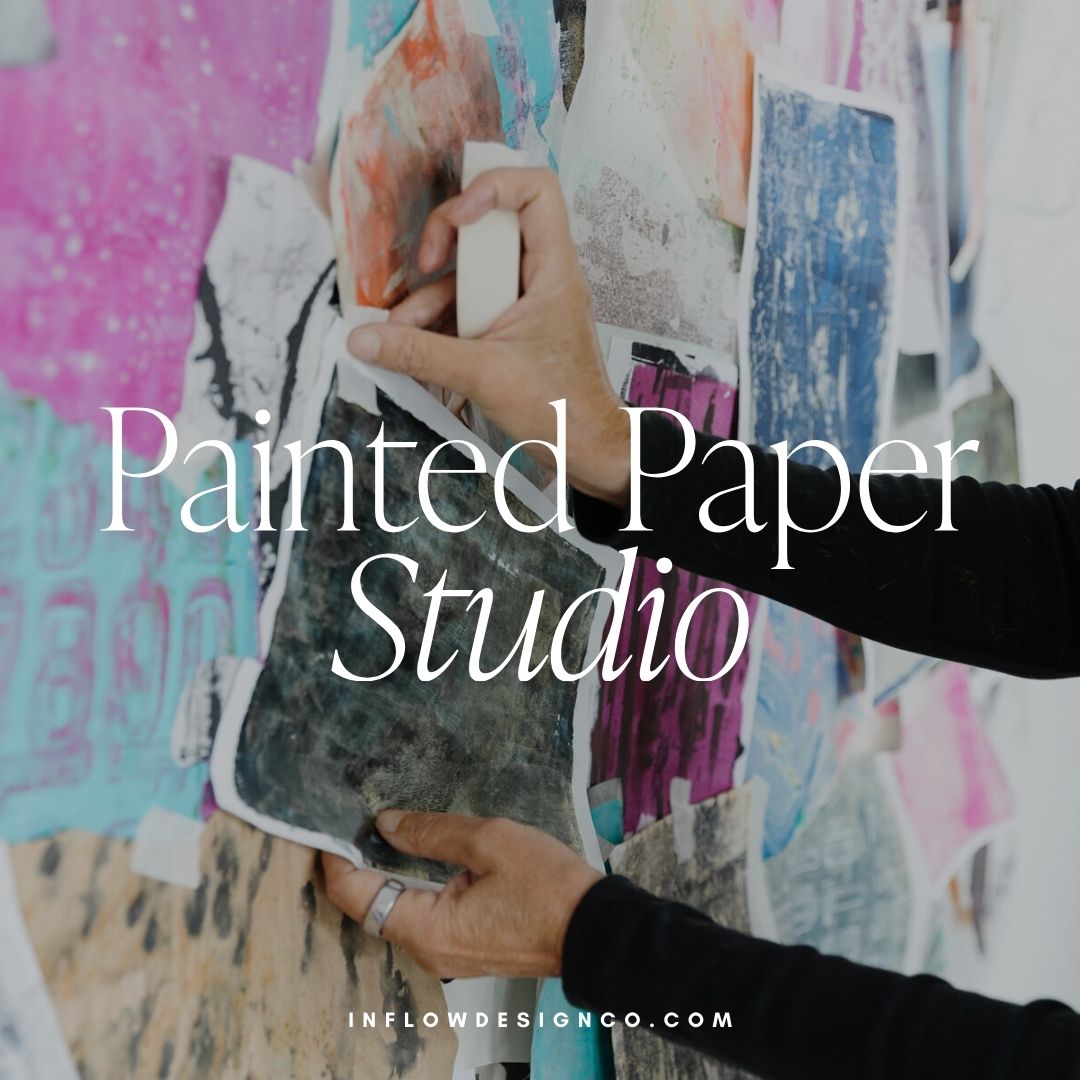
Jackie believes that creativity can be for everyone — no experience necessary. Art has been a part of her life for as long as she can remember. As a child, she was always drawing, painting, or crafting something. Art was her joy, her escape, and her way of expressing herself. She is not here to teach you how to be a “great artist.” She’s here to show you how to fall in love with creating. Whether you’re a retiree looking for a new hobby, someone who’s always believed they weren’t “creative,” or an experienced artist feeling stuck, her approach is all about how creating makes you feel.
Are you ready to launch that new business or elevate your current brand/website? Check out our services!
Girlboss Designer specializes in the travel industry and the online coaching industry – all serving women entrepreneurs. CLICK HERE to learn more about our services and how we can help!
