Amy, the founder of Mom’s Gone Wandering, aimed to create a brand that exuded luxury, fun, and boho vibes. Her inspiration stemmed from a wide range of travel experiences, spanning from outdoor adventures to lavish getaways.
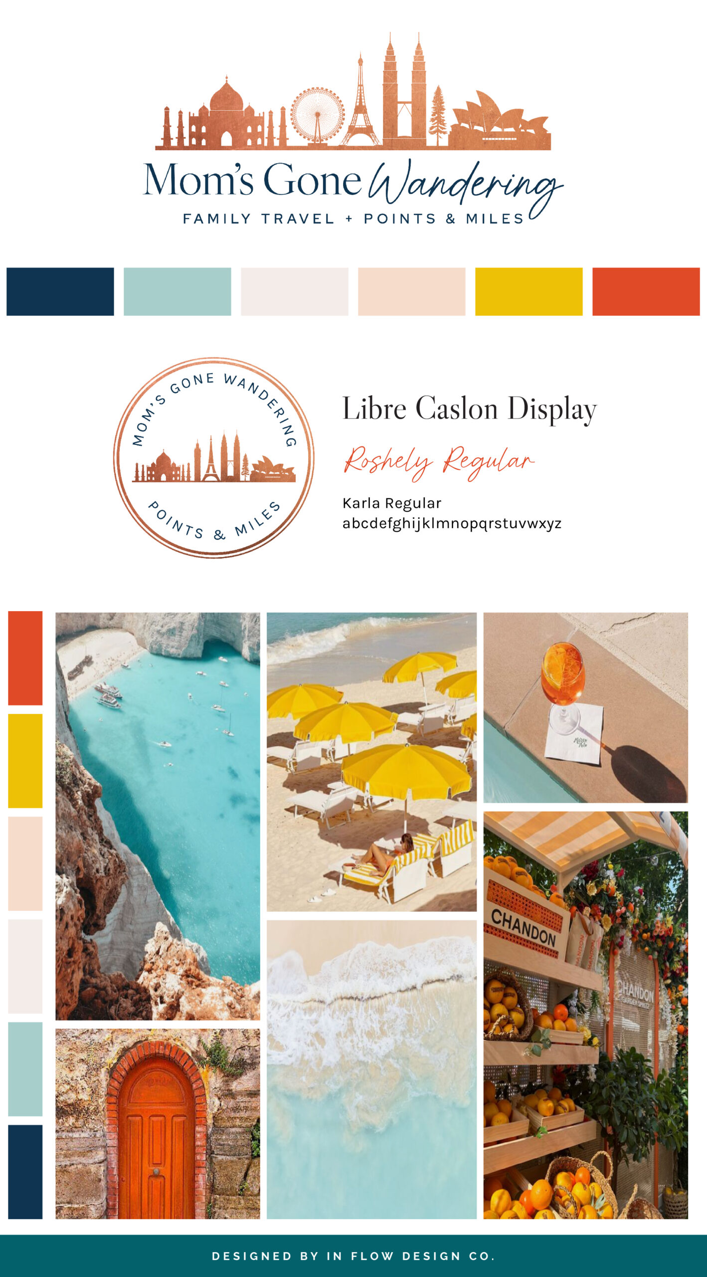
To bring this vision to life, we employed a color palette featuring navy, turquoise, orange, yellow, and warm neutrals. The navy conveys professionalism and adds a touch of luxury, while the turquoise symbolizes communication. The pops of orange and yellow create a fun and welcoming vibe. The warm neutrals serve to balance the bolder colors and enhance the welcoming ambiance.
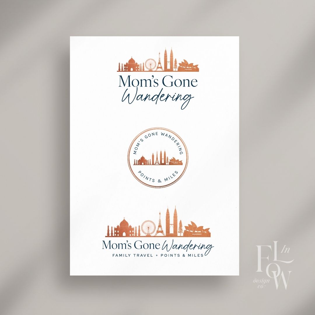
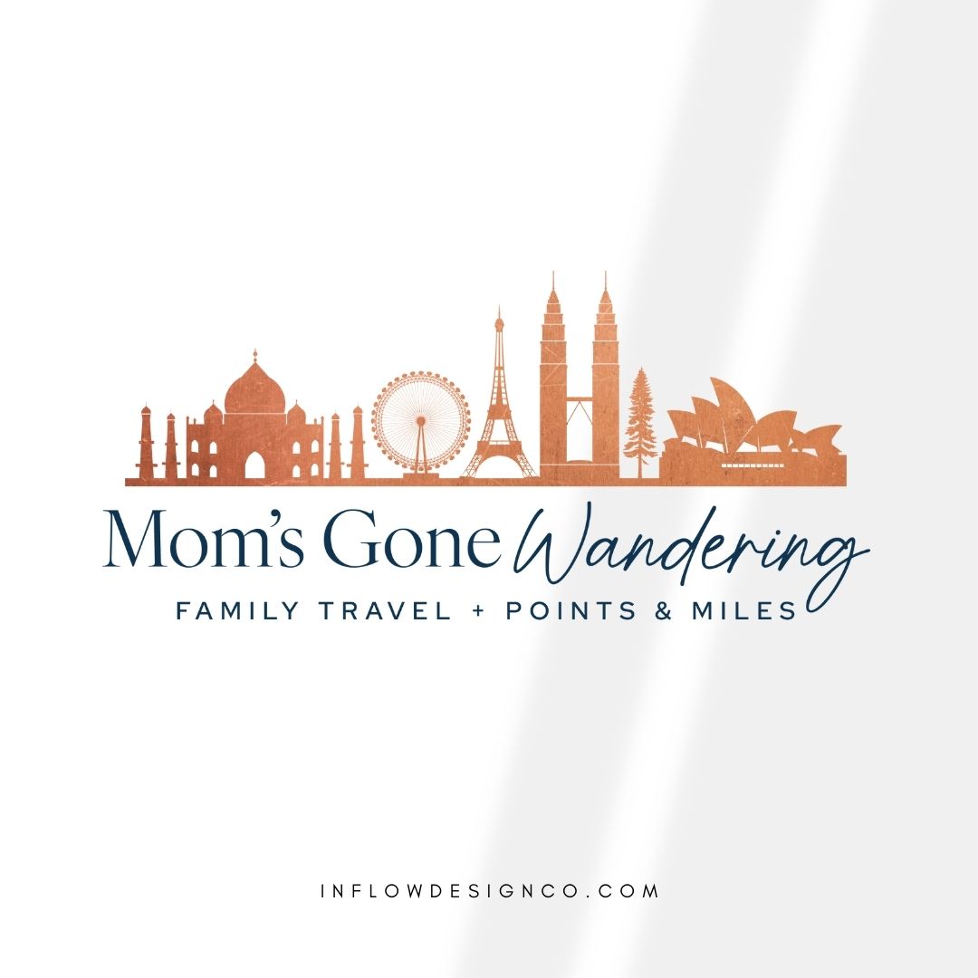
The focal point of the logo is a symbol showcasing several iconic landmarks from around the world. The main logo font is a serif typeface with varying letter weights, evoking a sense of upscale sophistication. The word “Mom” is rendered in a clear, legible script font, giving it an approachable feel. Additionally, a clean and modern sans-serif font is used for the tagline, providing balance to the overall design.Like this comment.
Don’t forget to check out the website reveal here.
You can check out the branding and website by clicking here.


Amy is a a working mom with two littles at home and she loves to travel. She leverages credit card points and miles to travel the world with her family. For YEARS she dreamed of traveling the world, but I always had champagne taste and a beer budget. Then she learned how to use points & miles and it changed everything! Now, Amy gets to take her entire family on trips that would not be possible otherwise. Recently they went to Australia, NZ and Fiji for 3 weeks for a fraction of what it should have cost. Last year it was London and the Cotswolds for NEARLY FREE. Her mission is to get you there.
Are you ready to launch that new business or elevate your current brand/website? Check out our services!
Girlboss Designer specializes in the travel industry and the online coaching industry – all serving women entrepreneurs. CLICK HERE to learn more about our services and how we can help!
